


Light and Material Harmony: How to Balance Wood, Metal, and Glass in Your Home

The way light interacts with different materials—wood, metal, and glass—is one of the most overlooked aspects of interior design. Yet this interplay between light and material harmony is precisely what separates a thoughtfully designed home from one that feels disjointed. When you understand how different surfaces absorb, reflect, and diffuse light, you gain control over the entire mood and flow of your space. This knowledge transforms how you select and place fixtures, ultimately creating rooms that feel intentional and warm rather than accidental.
Why Material Surfaces Matter When Designing with Light
Every material in your home has an optical personality. Wood absorbs light and creates warmth through its natural grain and earthy undertones. Metal reflects light, creating brightness and visual rhythm. Glass bends and transmits light, adding dimensionality and airiness. When these three materials coexist without a lighting strategy, they can create visual conflict—harsh reflections from metal competing with the warmth of wood, or glass surfaces creating distracting glare.
The key is understanding that light is the binding agent. When you layer your lighting thoughtfully, you're not just illuminating a room; you're orchestrating a conversation between materials. You're saying: "This wood floor grounds us. This metal frame draws the eye. This glass shelf creates a moment of lightness." This is the language of cohesive, emotionally intelligent design.
Warm Light as a Unifier Across Mixed Materials
Color temperature is your greatest ally in creating material harmony. Warm light—typically in the 2700K to 3000K range—naturally complements all three materials:
- Wood: Warm light amplifies the richness of wood grain and deepens its golden, honey-like tones
- Metal: Warm light softens the industrial quality of steel or brass, making it feel refined rather than cold
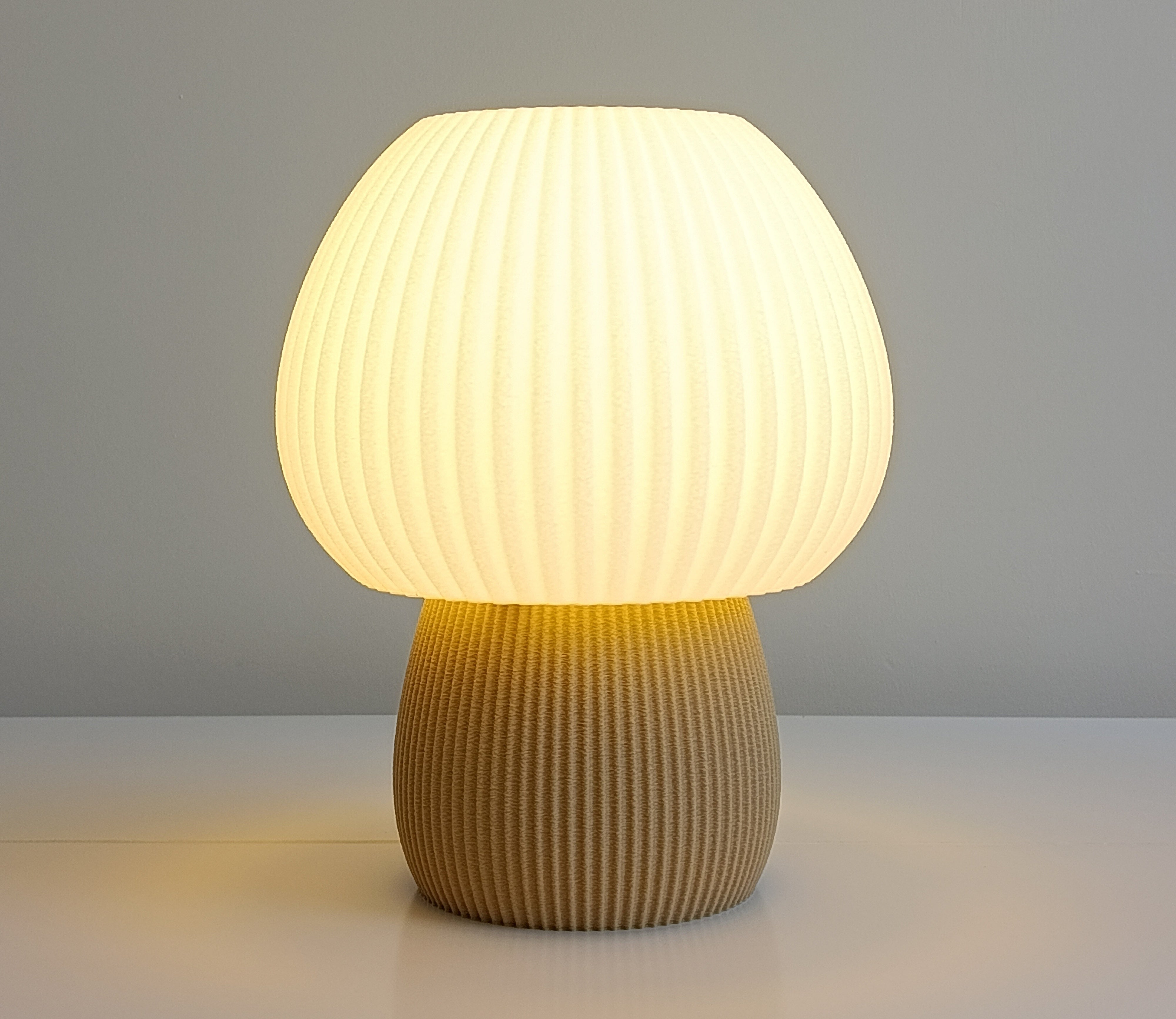
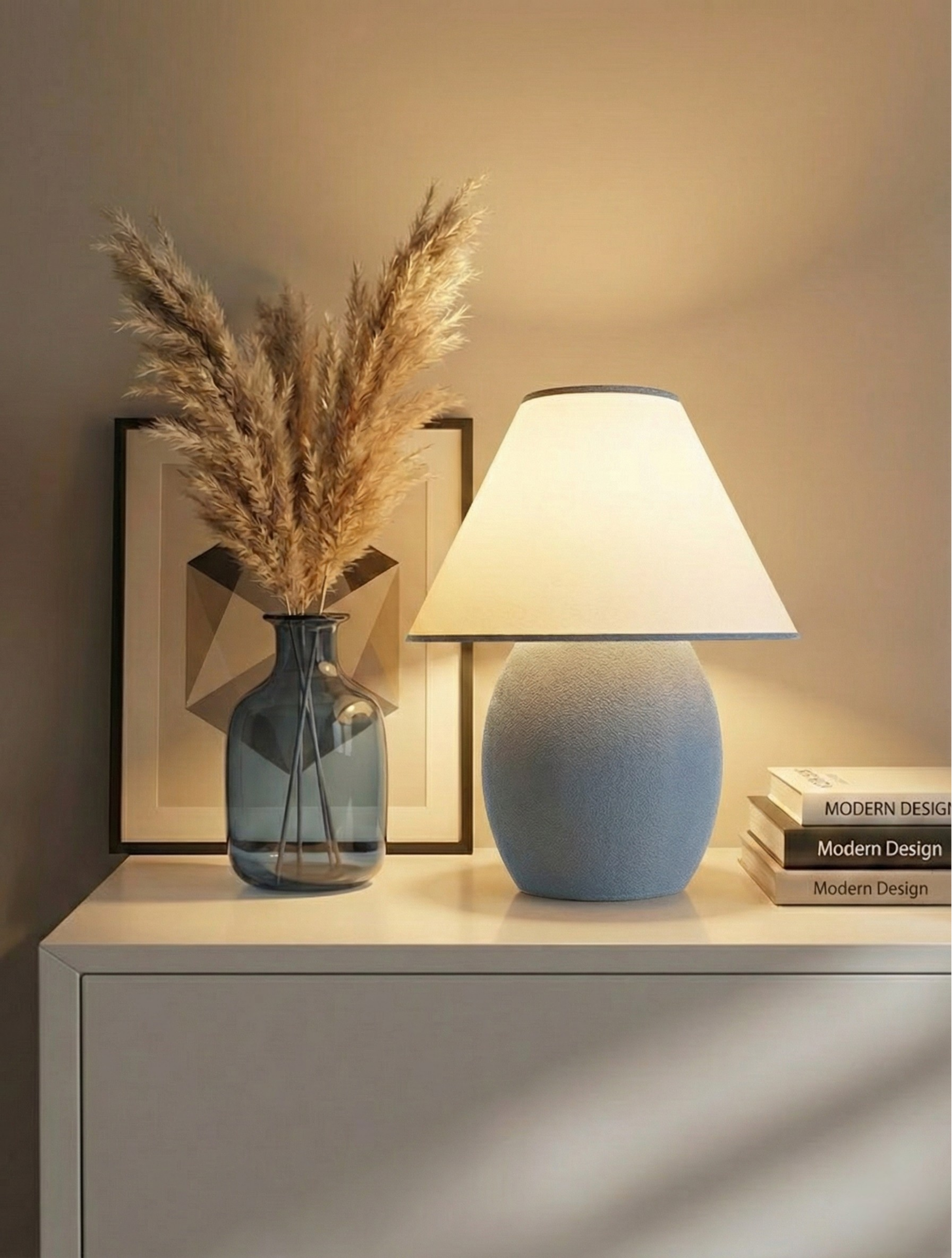
- Glass: Warm light creates a gentle glow when transmitted through glass, rather than harsh, clinical brightness
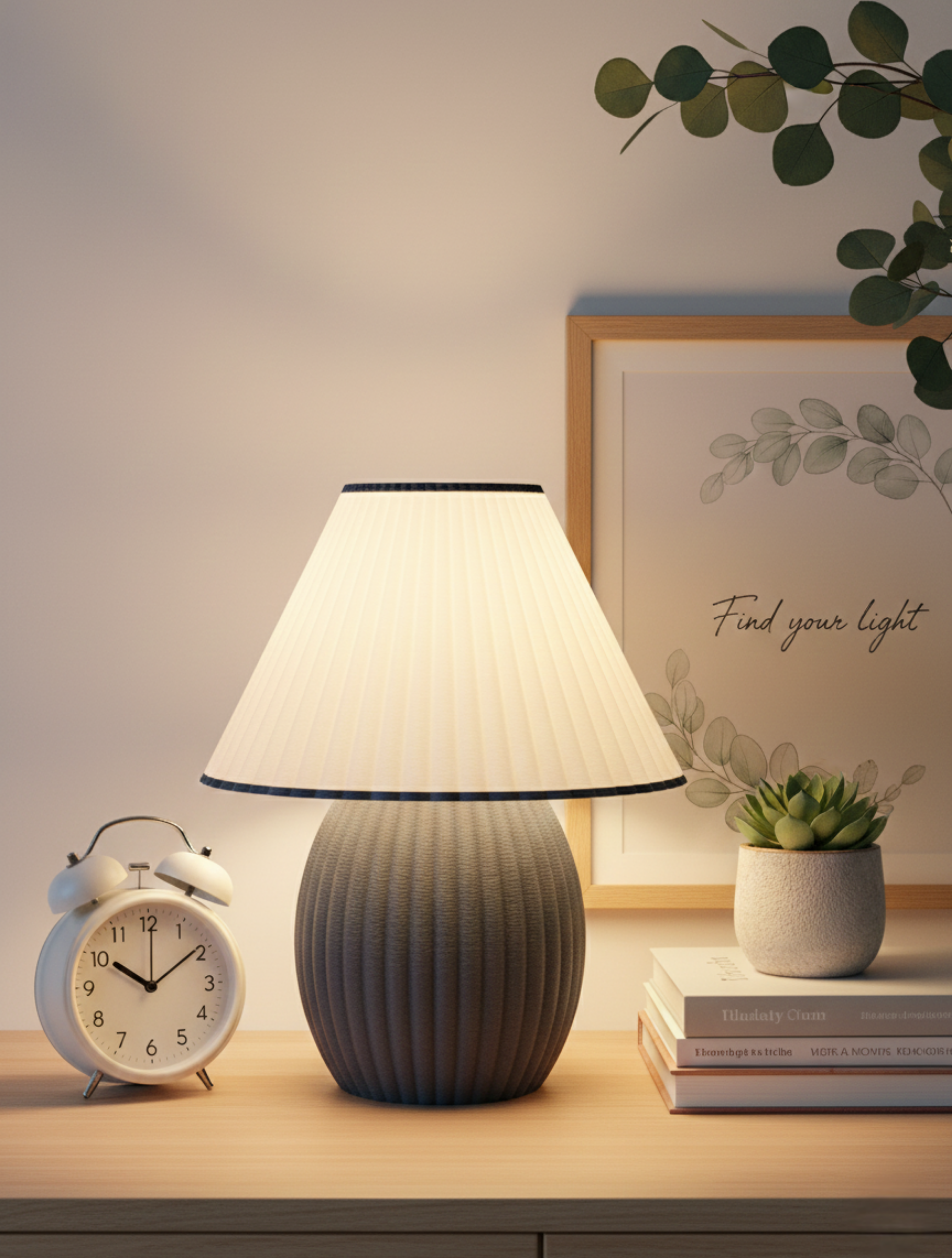
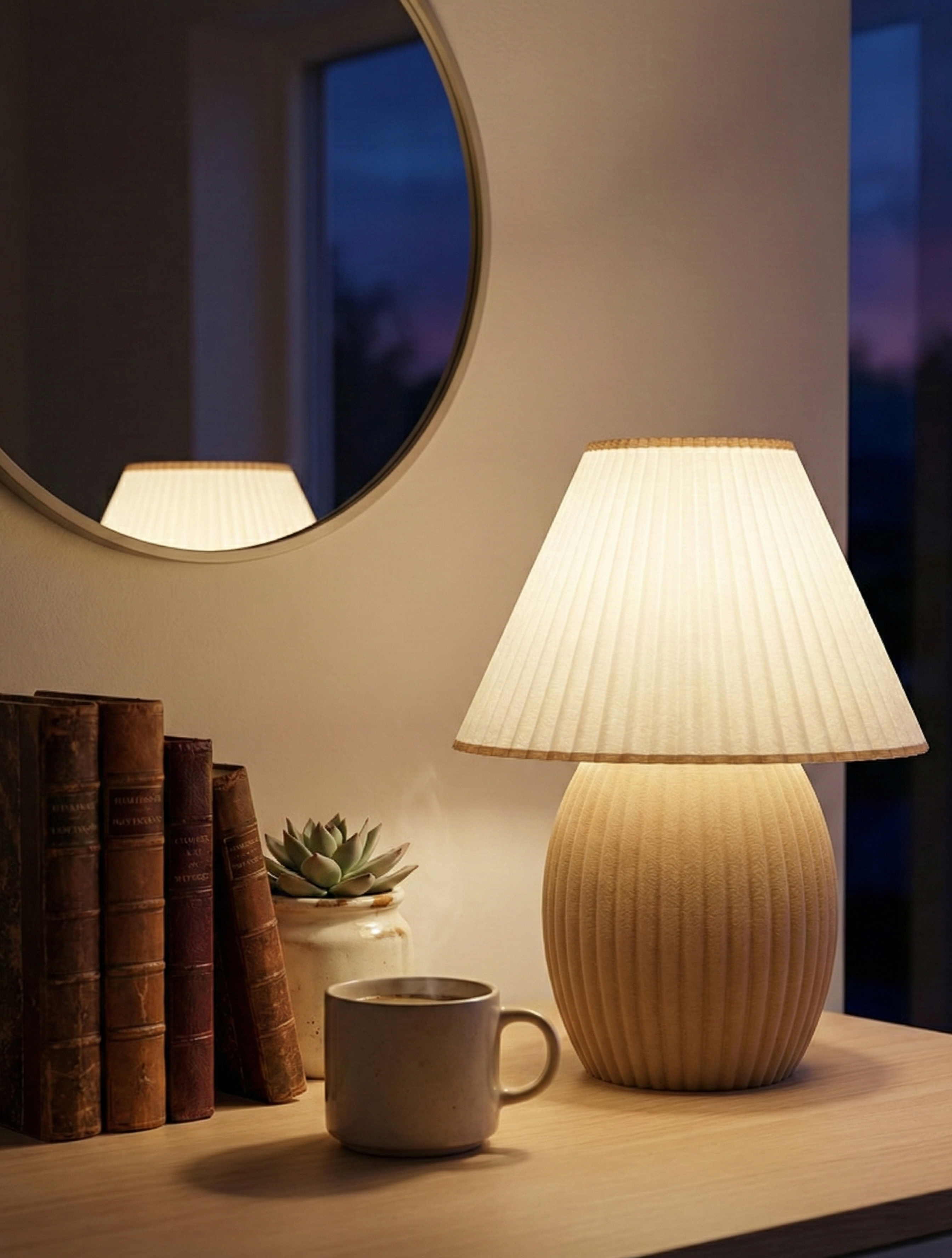
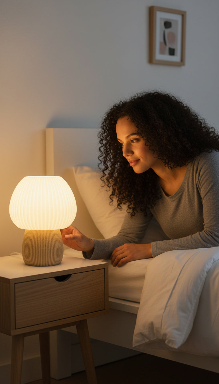
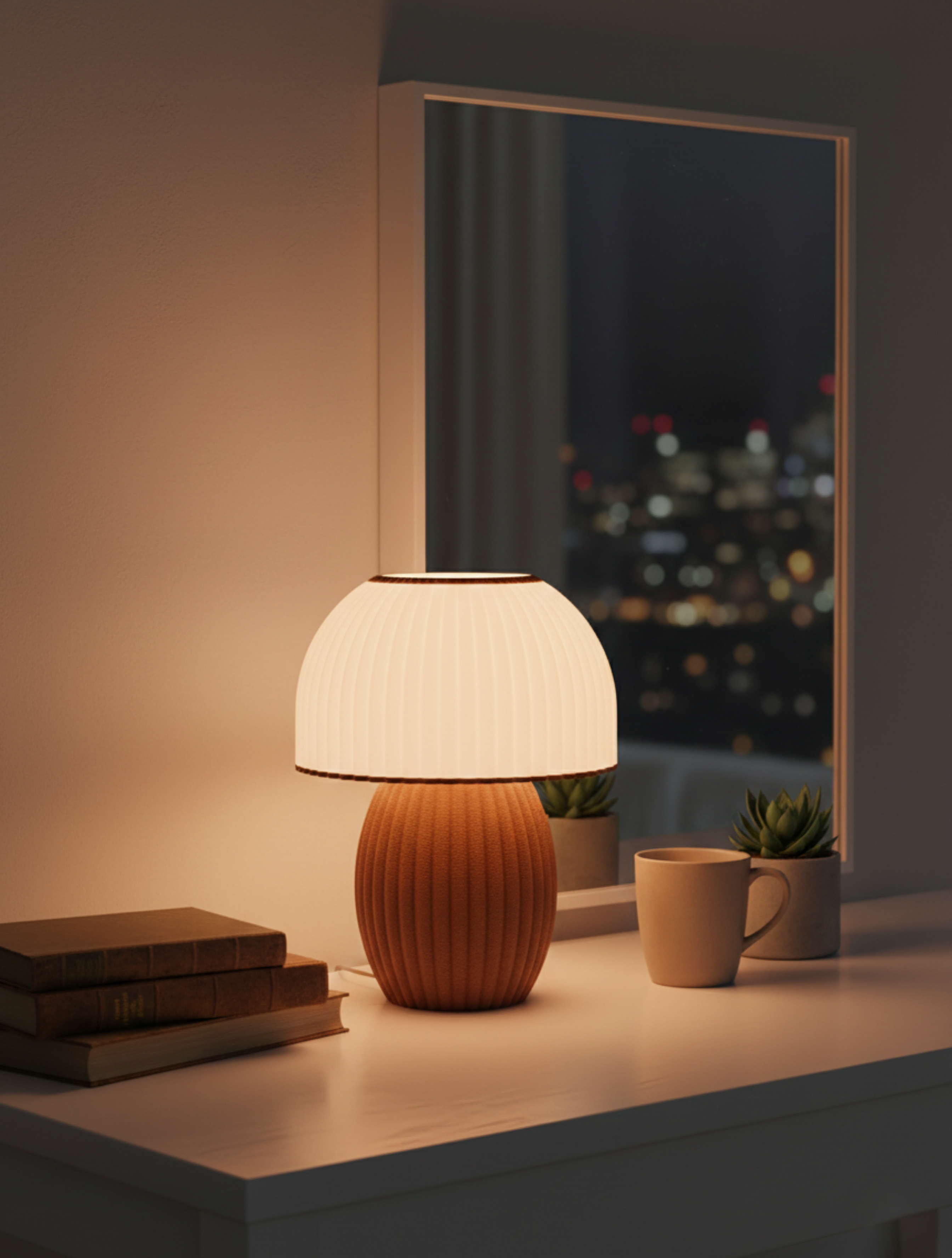
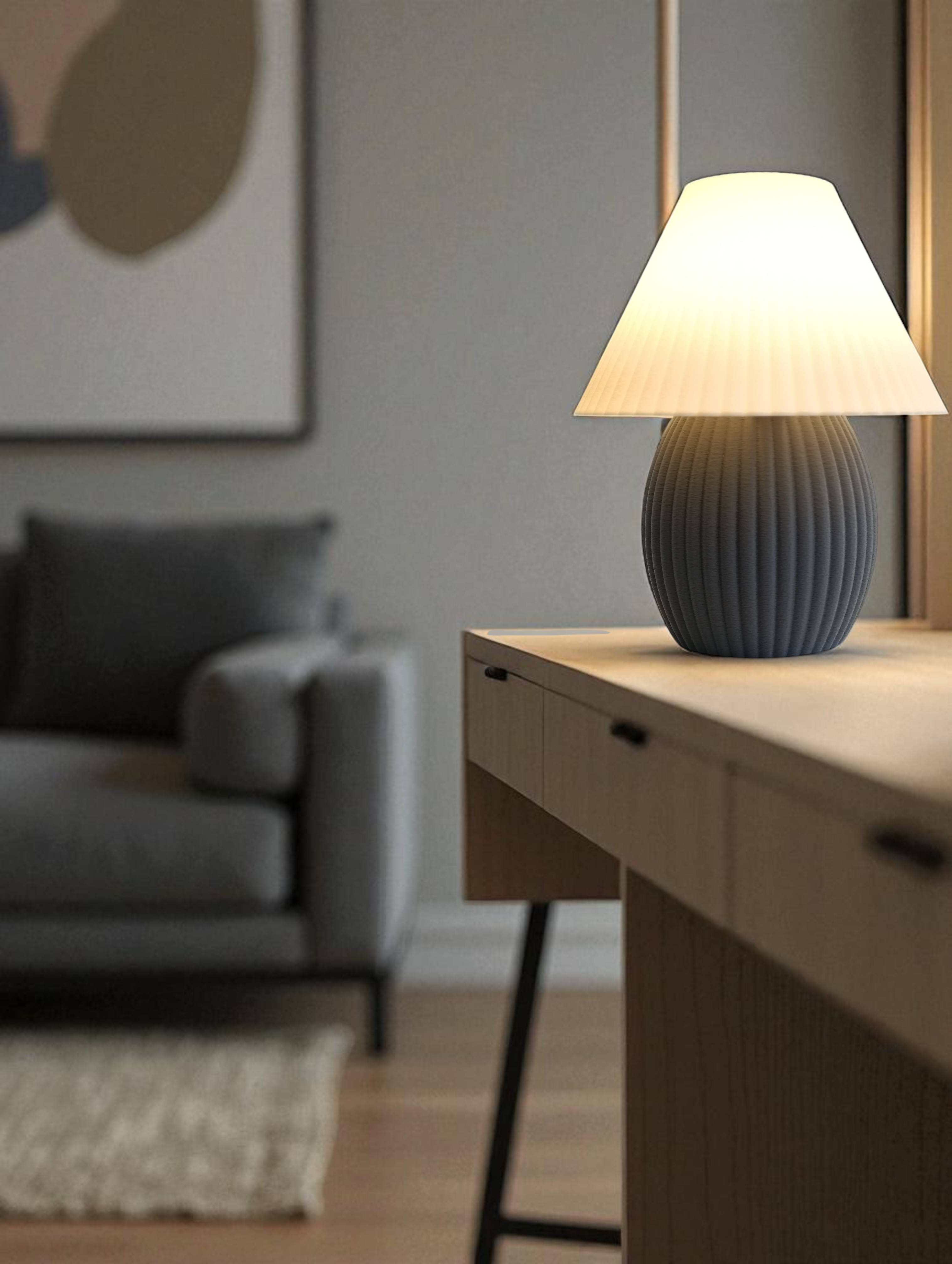
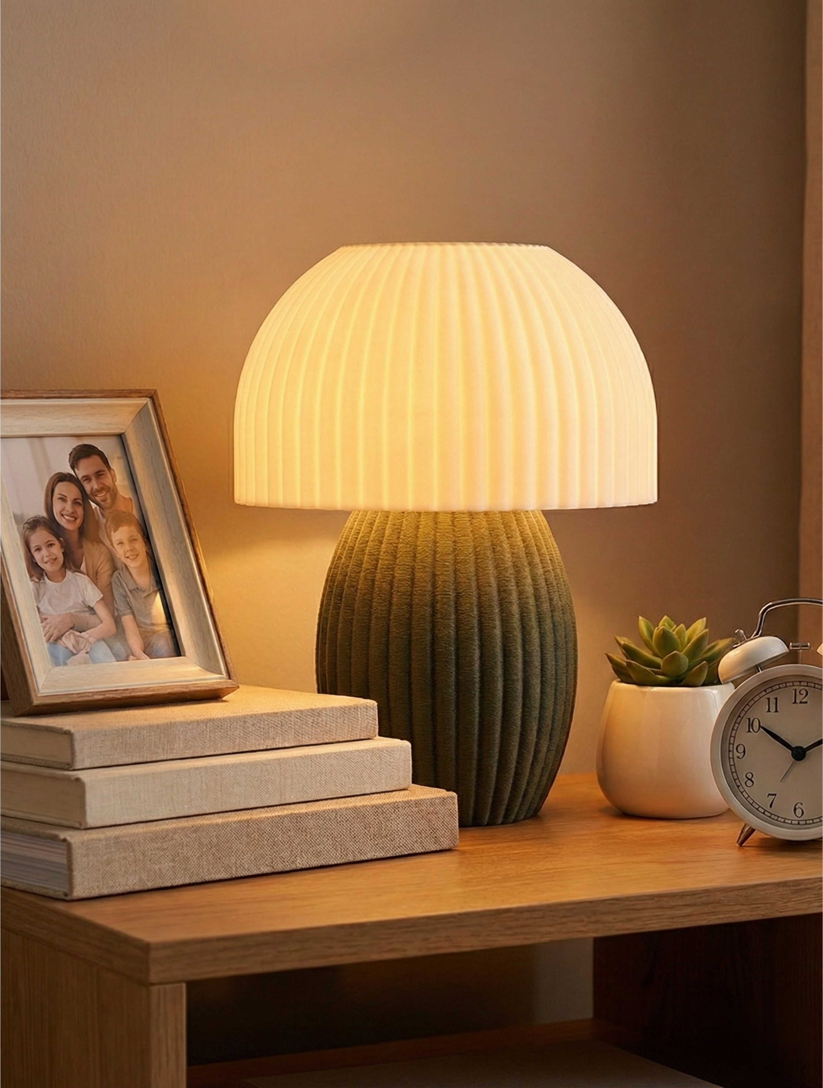
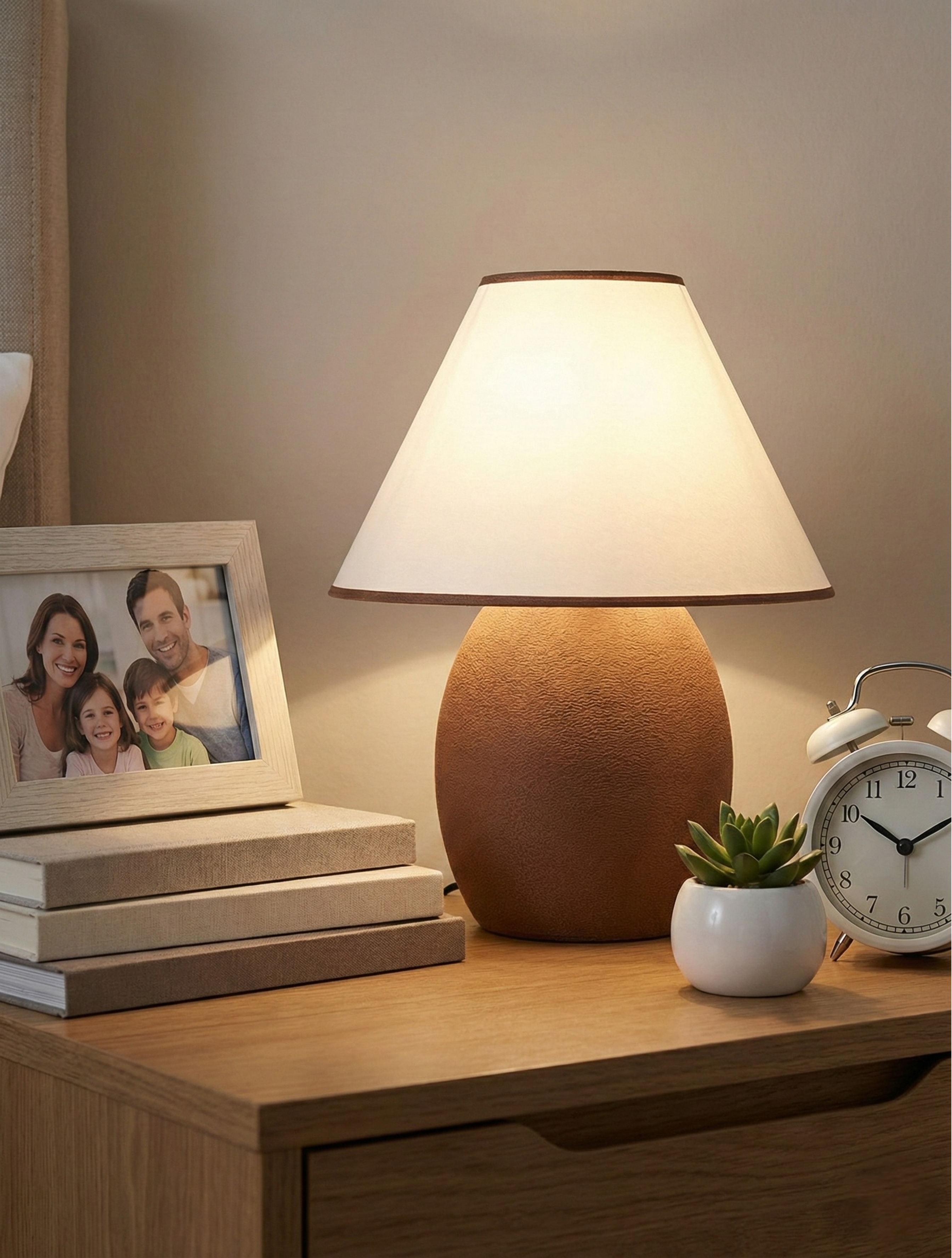
Consider using dimmable fixtures with warm color temperatures throughout your home. This gives you flexibility to adjust the mood while maintaining consistency. Pendant lights and table lamps with warm bulbs create intimate pools of light that feel inviting, while also making mixed materials feel intentional rather than eclectic.
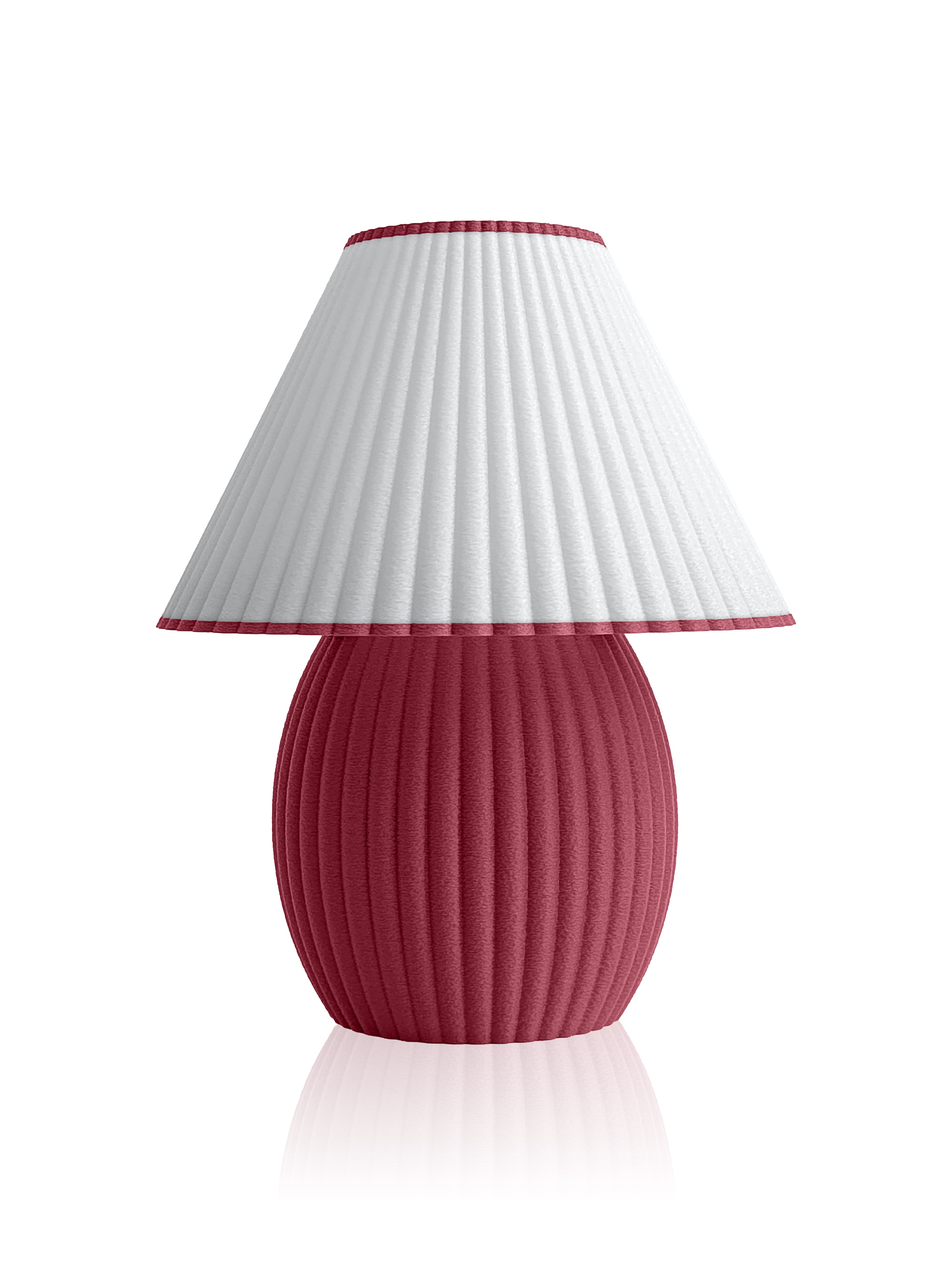
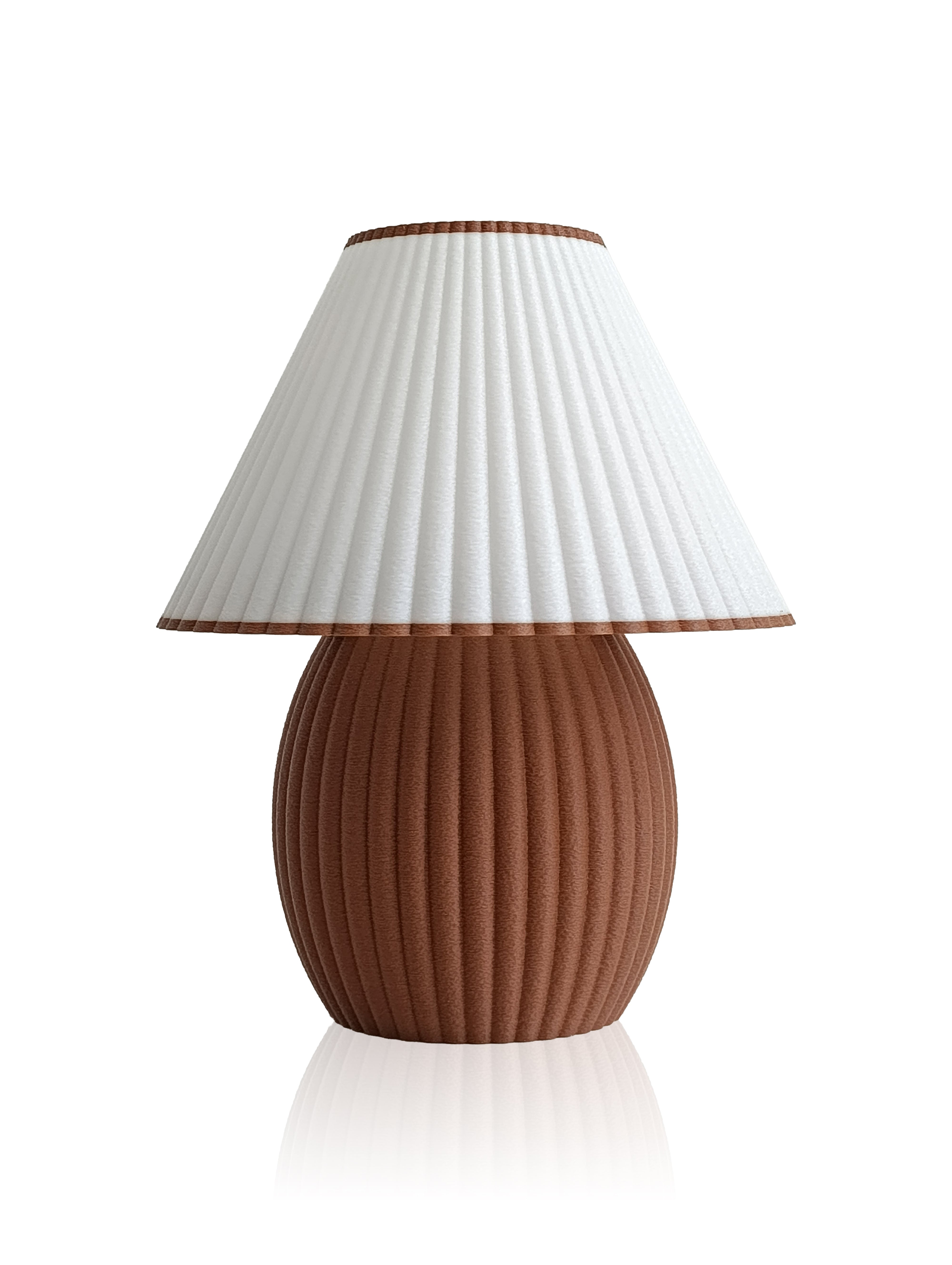
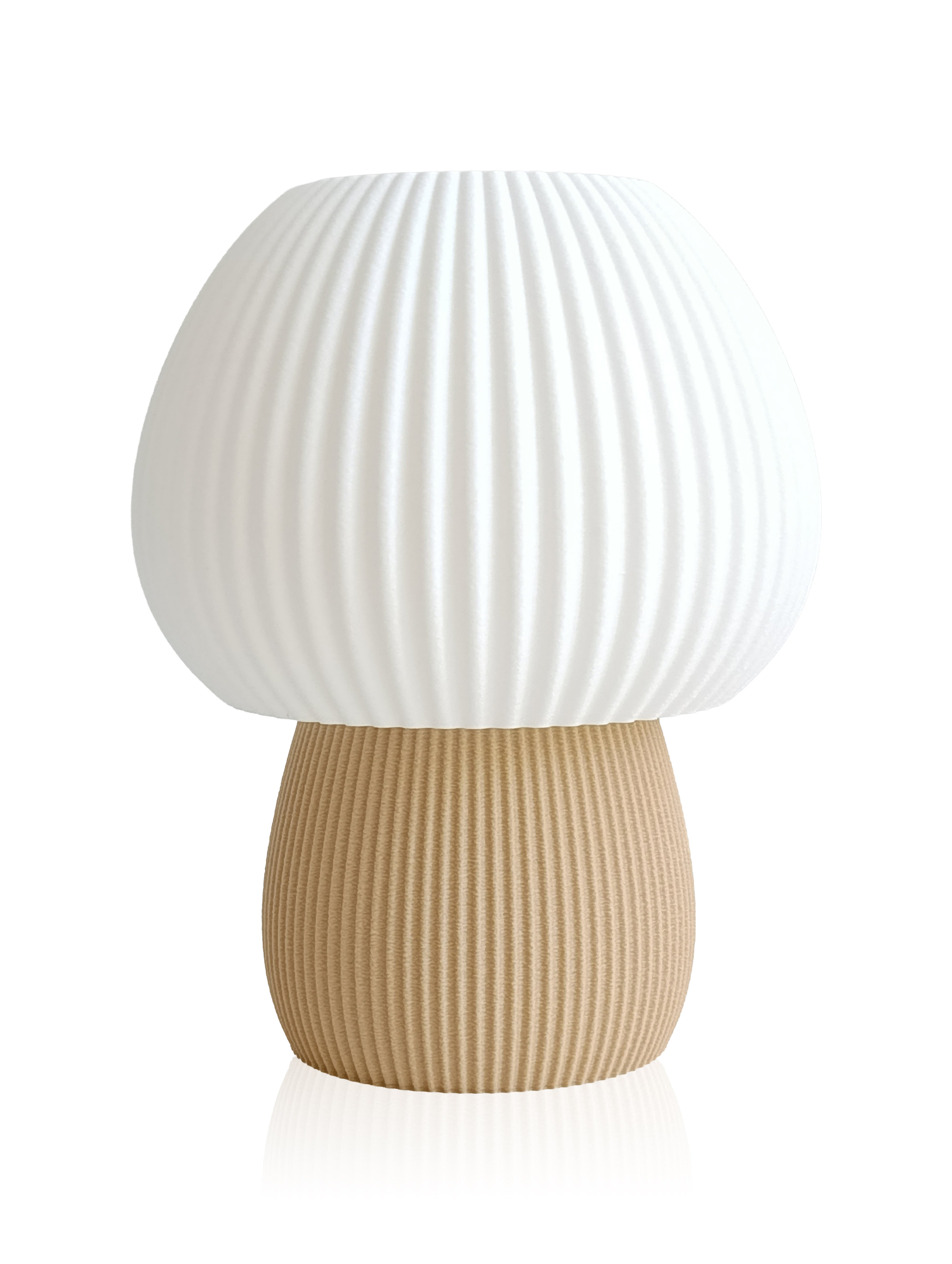
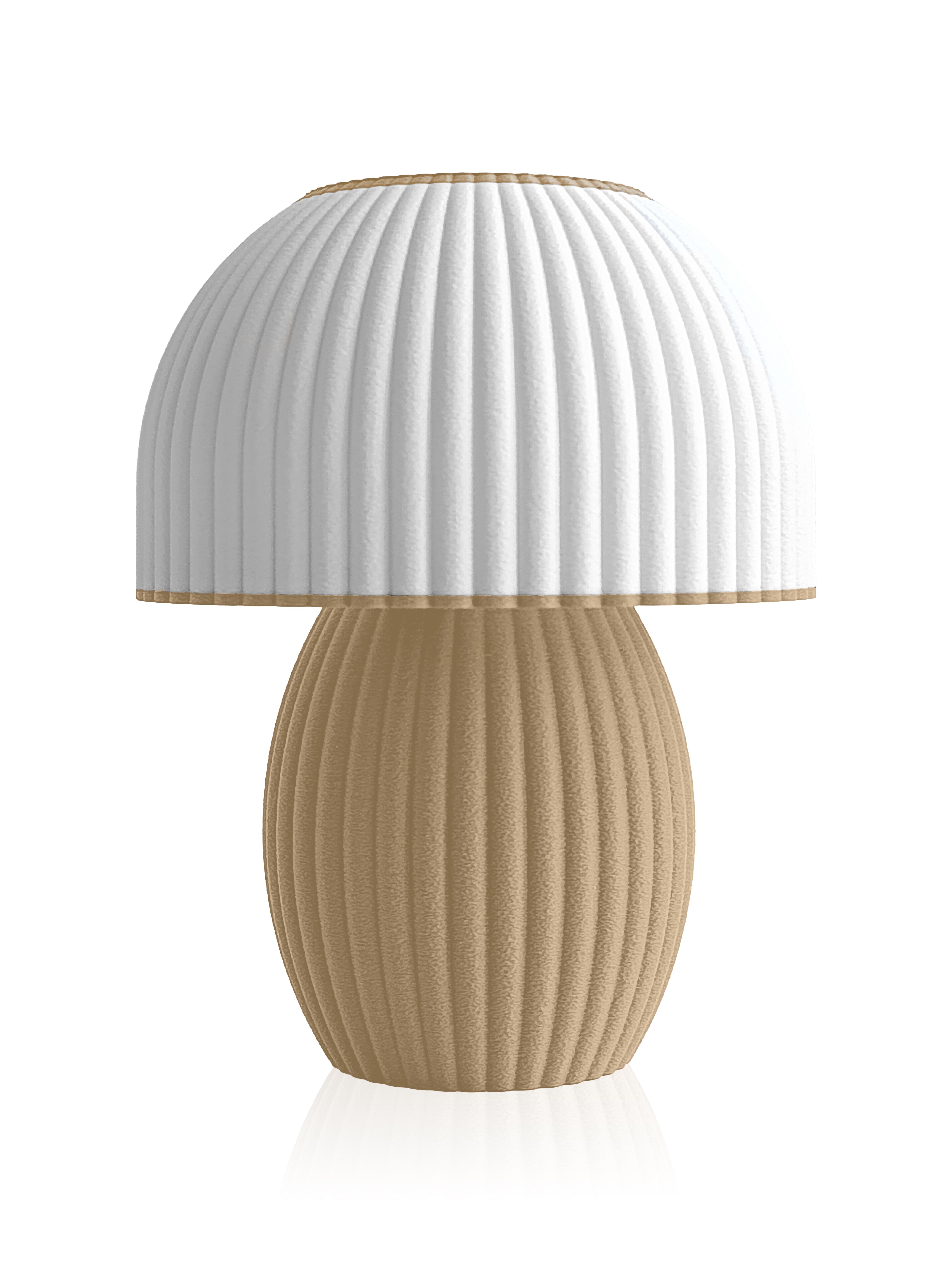
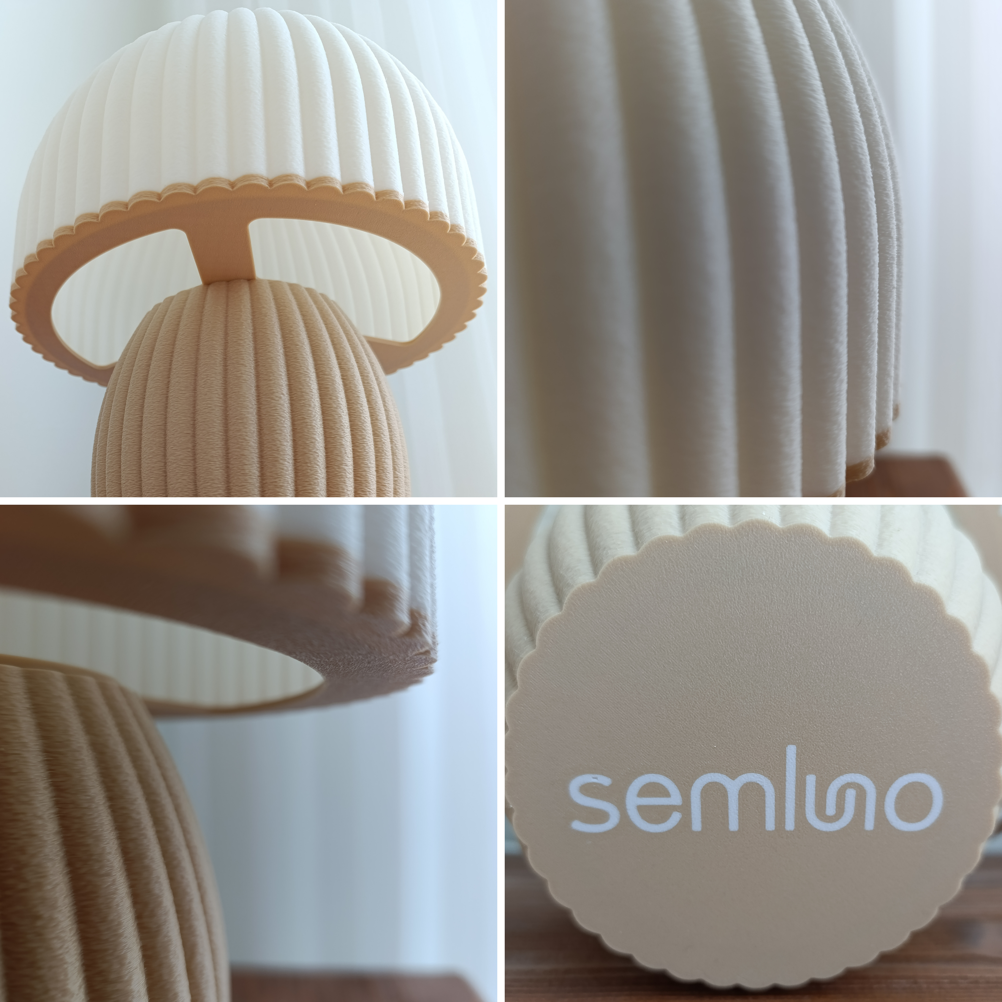
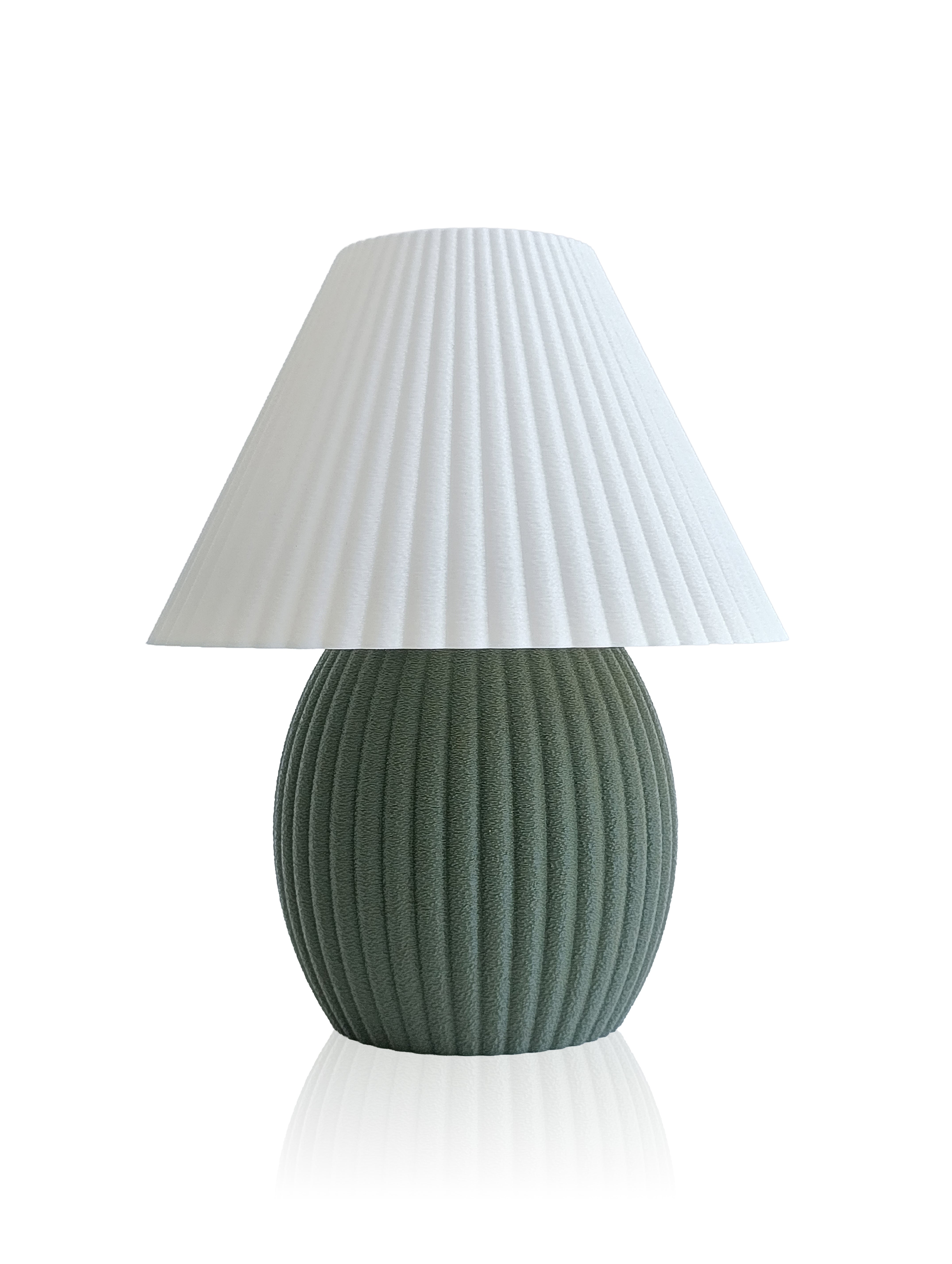
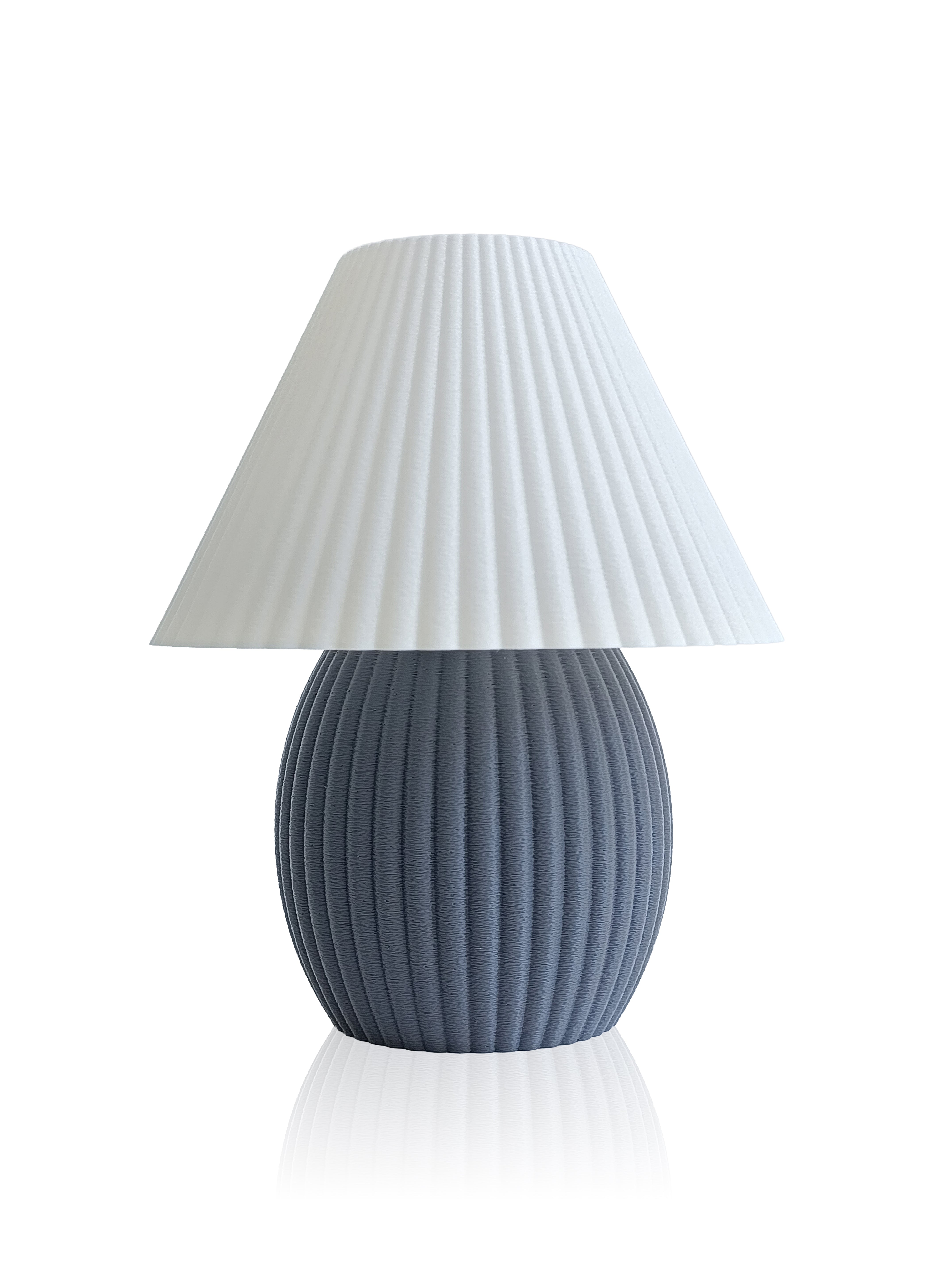
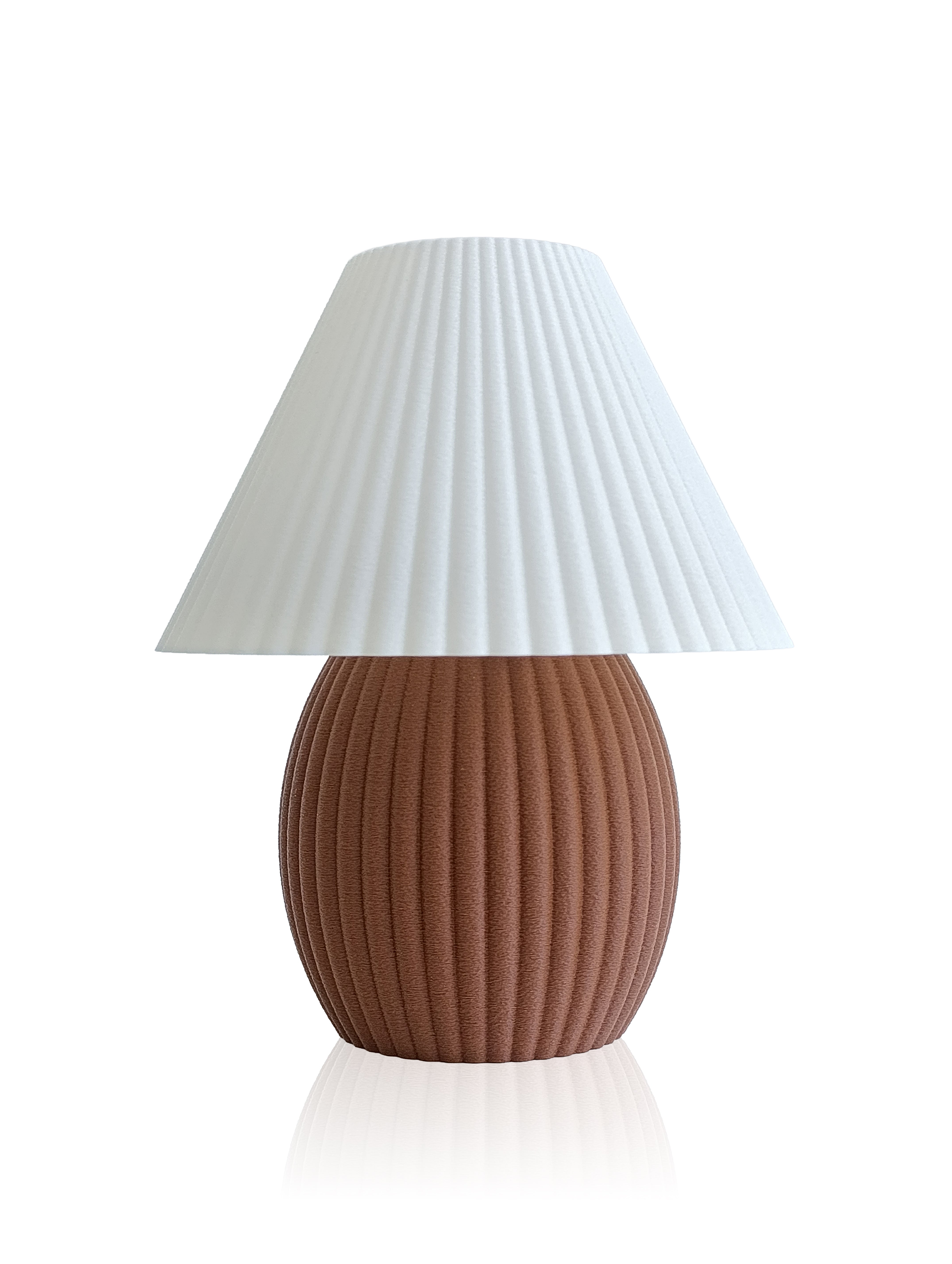
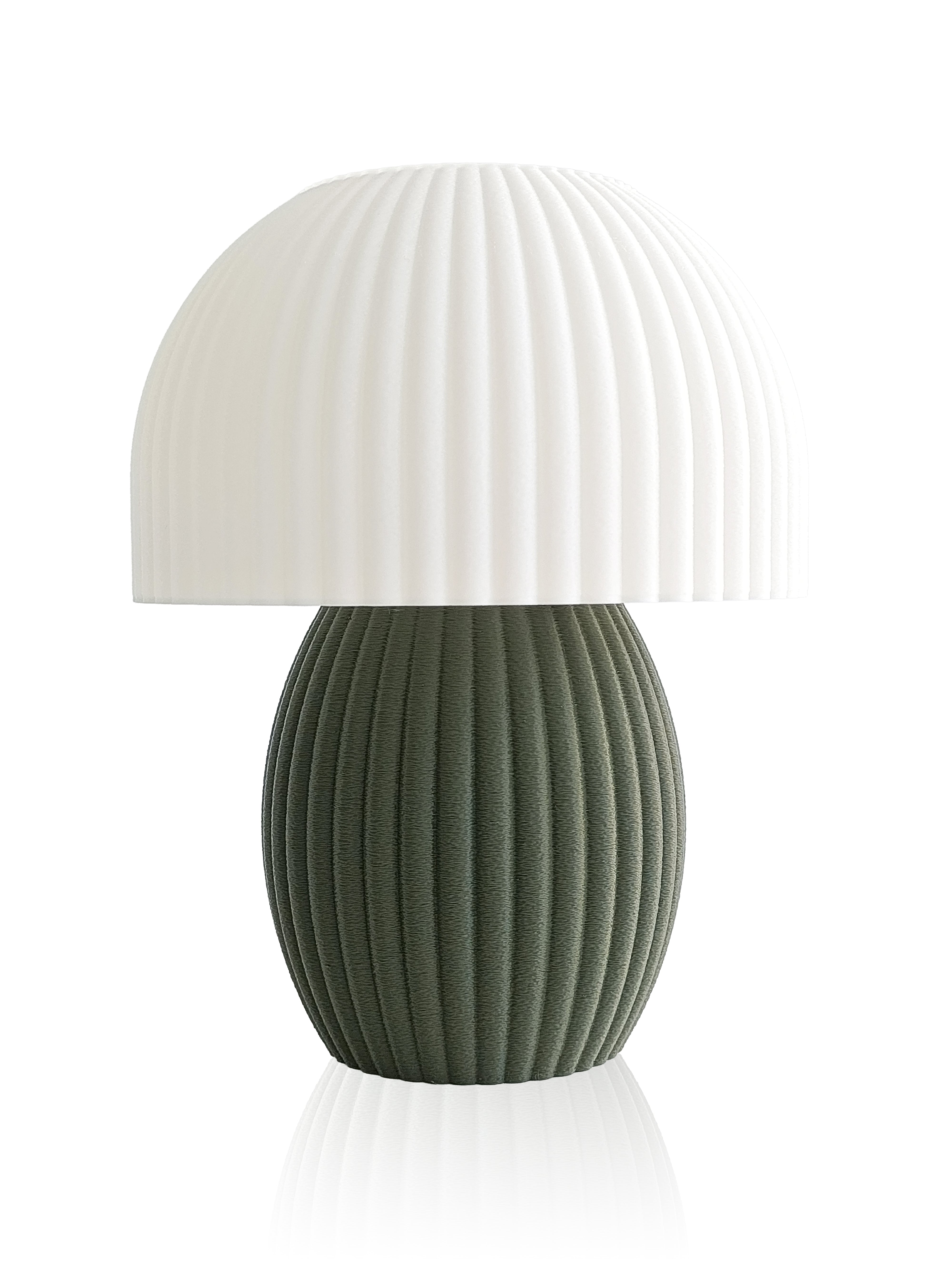
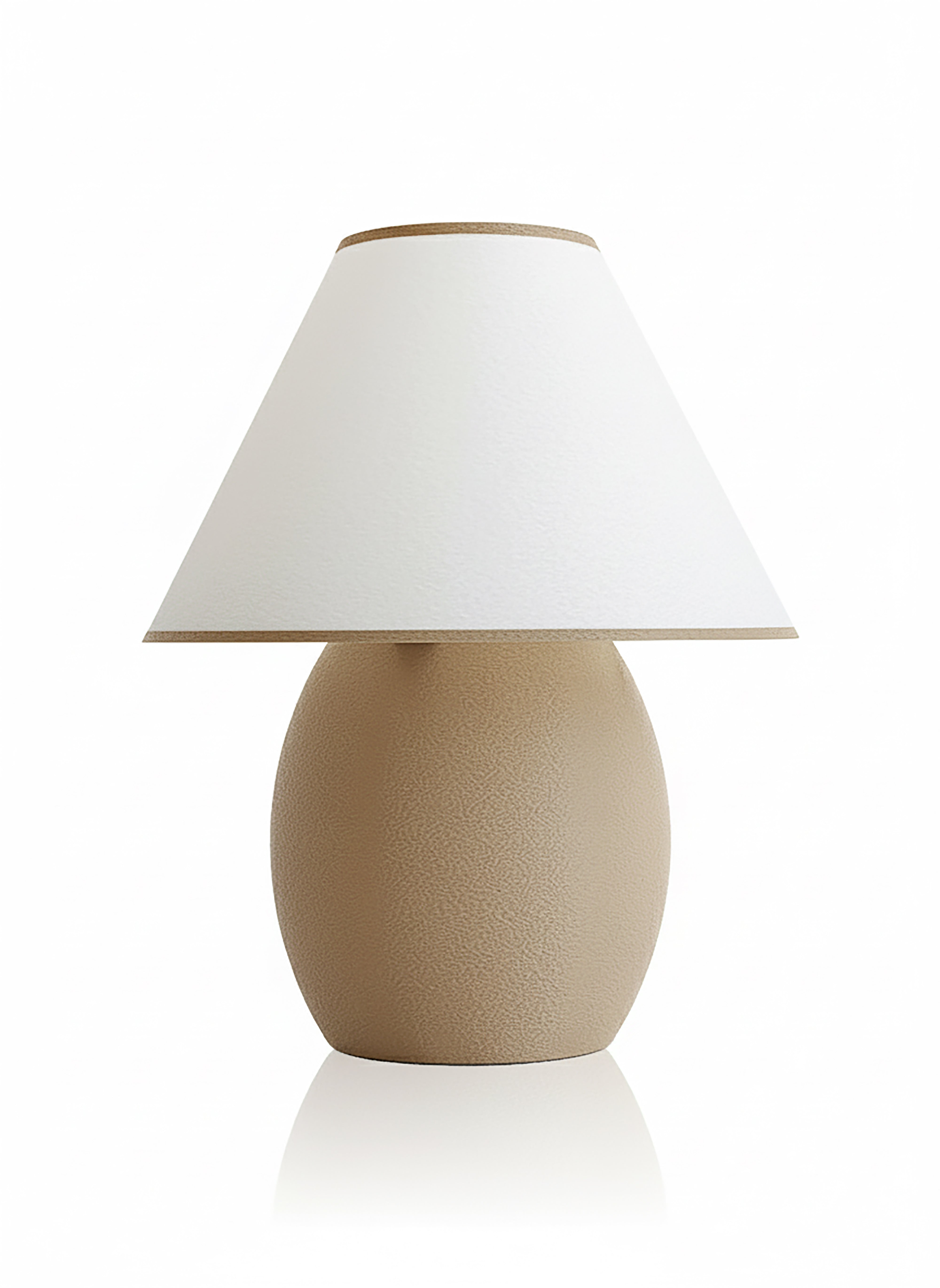
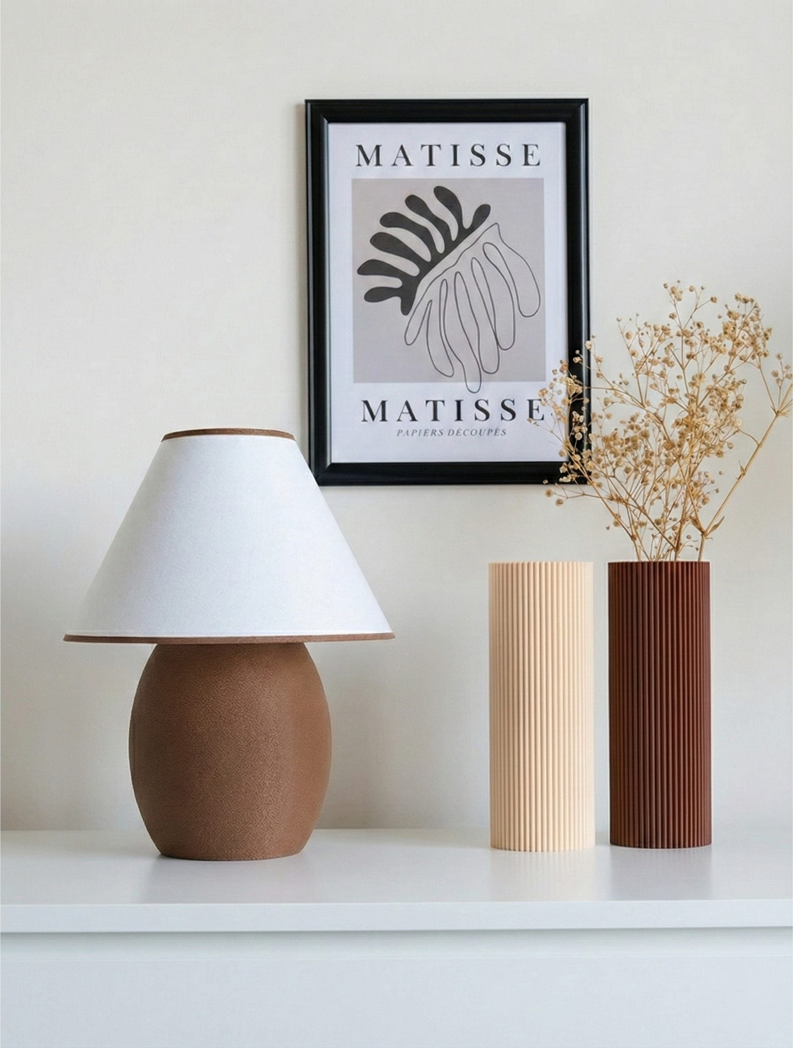
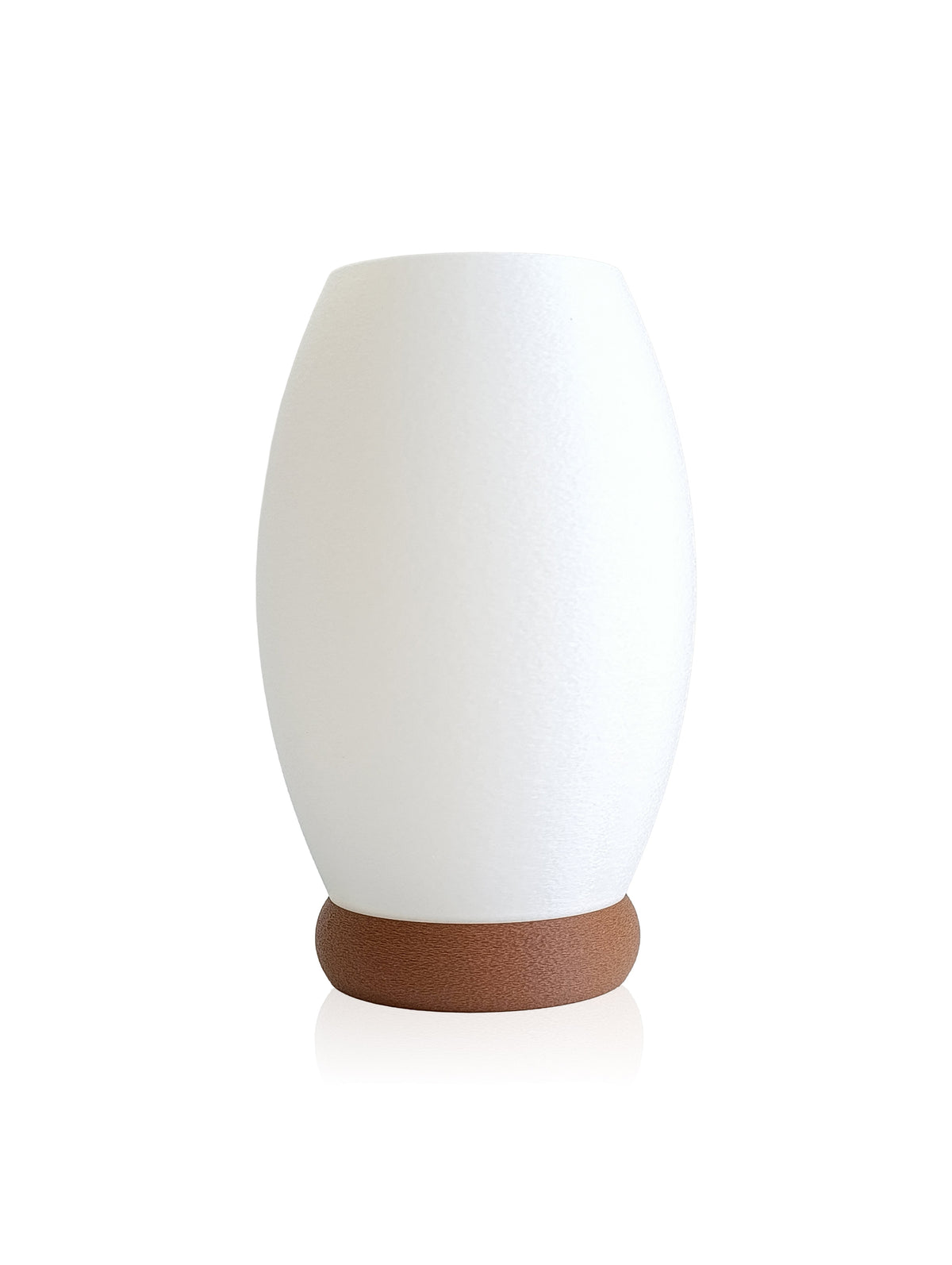
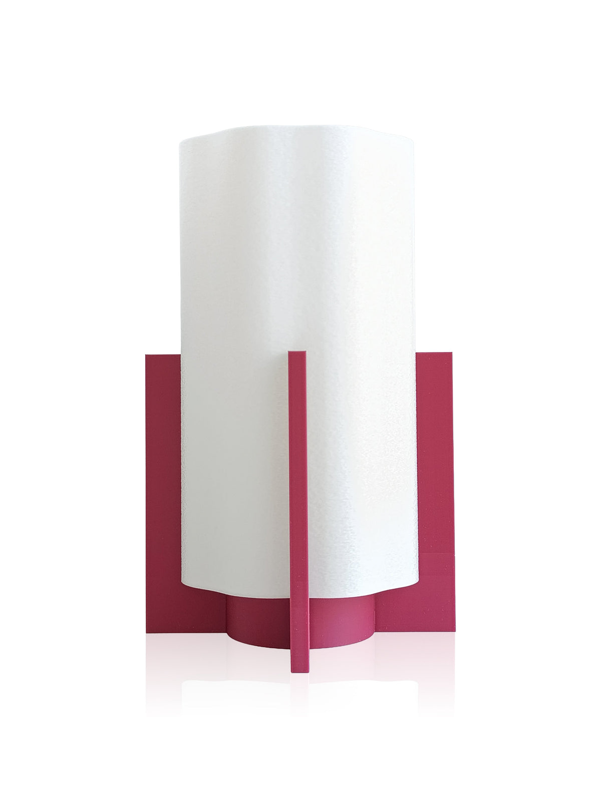
The Friloon collection exemplifies this principle—its thoughtful design works beautifully across varied material palettes, allowing the fixture itself to integrate rather than compete with your surfaces.
Balancing Reflection and Absorption in Material Layering
One of the most practical challenges in designing with mixed materials is managing unwanted reflection and glare. Shiny metal fixtures and glass surfaces can create bright spots that feel jarring, especially in rooms with abundant natural light. Here's how to navigate this:
- Position reflective surfaces strategically: Use metal and glass where you want visual lift and movement—above sinks, in entryways, on shelving
- Soften reflections with layered lighting: Ambient light should dominate; accent lighting can highlight specific materials without overwhelming
- Use diffusion to your advantage: Frosted glass, linen shades, and matte finishes reduce harsh reflections while maintaining the presence of reflective materials
- Balance with absorbent materials: Wood and matte finishes create visual rest, so distribute them proportionally throughout your space
When wood, metal, and glass are lit with intention, they create depth and visual interest. The eye moves from the warmth of wood to the sheen of metal to the transparency of glass, creating a natural rhythm that feels dynamic yet harmonious.
Creating Focal Points with Light and Material Combinations
A well-designed home uses light to draw attention to material combinations that matter. This might mean highlighting a walnut dining table with warm pendant lighting, using a metal-framed mirror to bounce light through a room, or positioning a glass-fronted bookshelf where morning light can pass through it. The Friloon Line offers flexible solutions for these moments—fixtures that enhance rather than dominate, allowing your materials to shine.
Focal points aren't about brightness; they're about intention. A dimly lit wooden cabinet with a small amount of accent lighting can be more compelling than a brightly lit blank wall. This principle applies whether you're designing a bedroom, kitchen, living room, or workspace.
Frequently Asked Questions
What light color temperature works best with mixed materials?
Warm light between 2700K and 3000K is ideal. It complements wood's warmth, softens metal's industrial edge, and creates a gentle glow through glass without feeling clinical or harsh.
How do I prevent glare from glass and metal surfaces?
Use diffused lighting with warm color temperature, position reflective surfaces where natural light can enhance them, and balance shiny materials with matte, absorbent surfaces like wood to create visual rest and reduce harsh reflections.
Can I use cool-toned lighting with warm wood and metal?
It's possible but challenging. Cool lighting (above 4000K) can make wood look gray and metal look cold. If you prefer cool tones, use them sparingly and pair with plenty of warm accent lighting to maintain harmony.
Closing: Your Home, Thoughtfully Lit
Light and material harmony isn't a luxury—it's a foundation for a home that feels cohesive and emotionally grounded. When you understand how light interacts with wood, metal, and glass, you're equipped to make intentional decisions about every fixture and surface. Your home becomes a space where materials converse rather than compete, where warmth and light work together to create rooms you genuinely want to inhabit. Start by assessing the materials already present in your space, then layer in warm, dimmable lighting that honors each surface. The result is a home that feels unmistakably yours.





Share:
Light and Creativity: How Lighting Influences Artistic Inspiration
Lampshade Fabric: How Pleated, Plain and Linen Textures Affect Light