
Light and Color Perception: How Lighting Changes Colors

Have you ever noticed how a paint color looks completely different in your home than it did in the store? Or how your favorite outfit appears to shift shade depending on where you're standing? The answer lies in light and color perception—a fascinating interplay between physics and biology that shapes how we experience every room in our homes. Understanding how lighting changes colors isn't just intellectually interesting; it's practically essential if you care about how your spaces feel and function.
Why Color Perception Depends on Light Source
Color doesn't exist independently from light. What we perceive as color is actually our brain's interpretation of wavelengths reflected off an object's surface and reaching our eyes. Without light, there is no color—only darkness. This fundamental truth means that the type of light illuminating a space directly influences which wavelengths reach our eyes, and therefore, which colors we perceive.
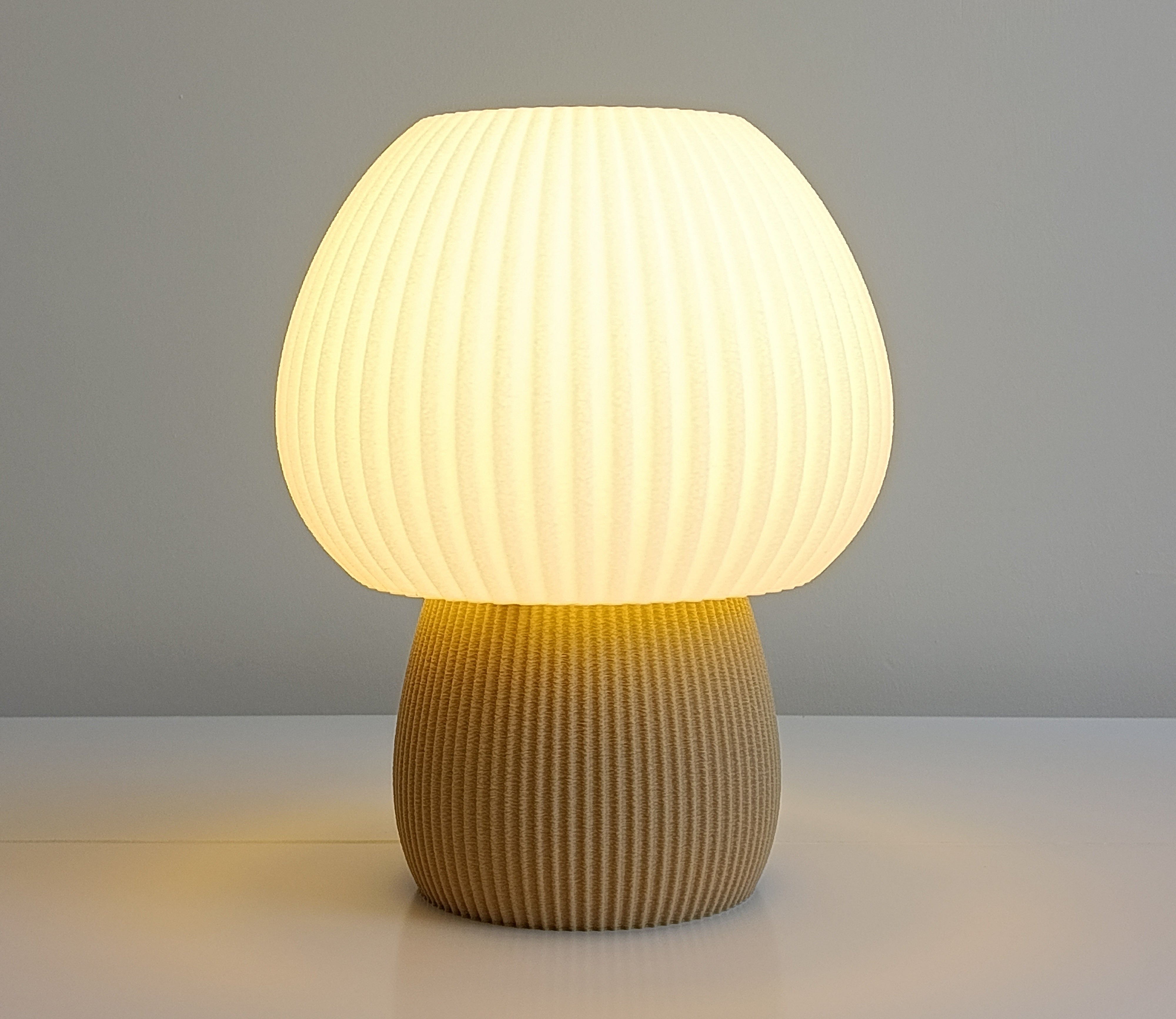
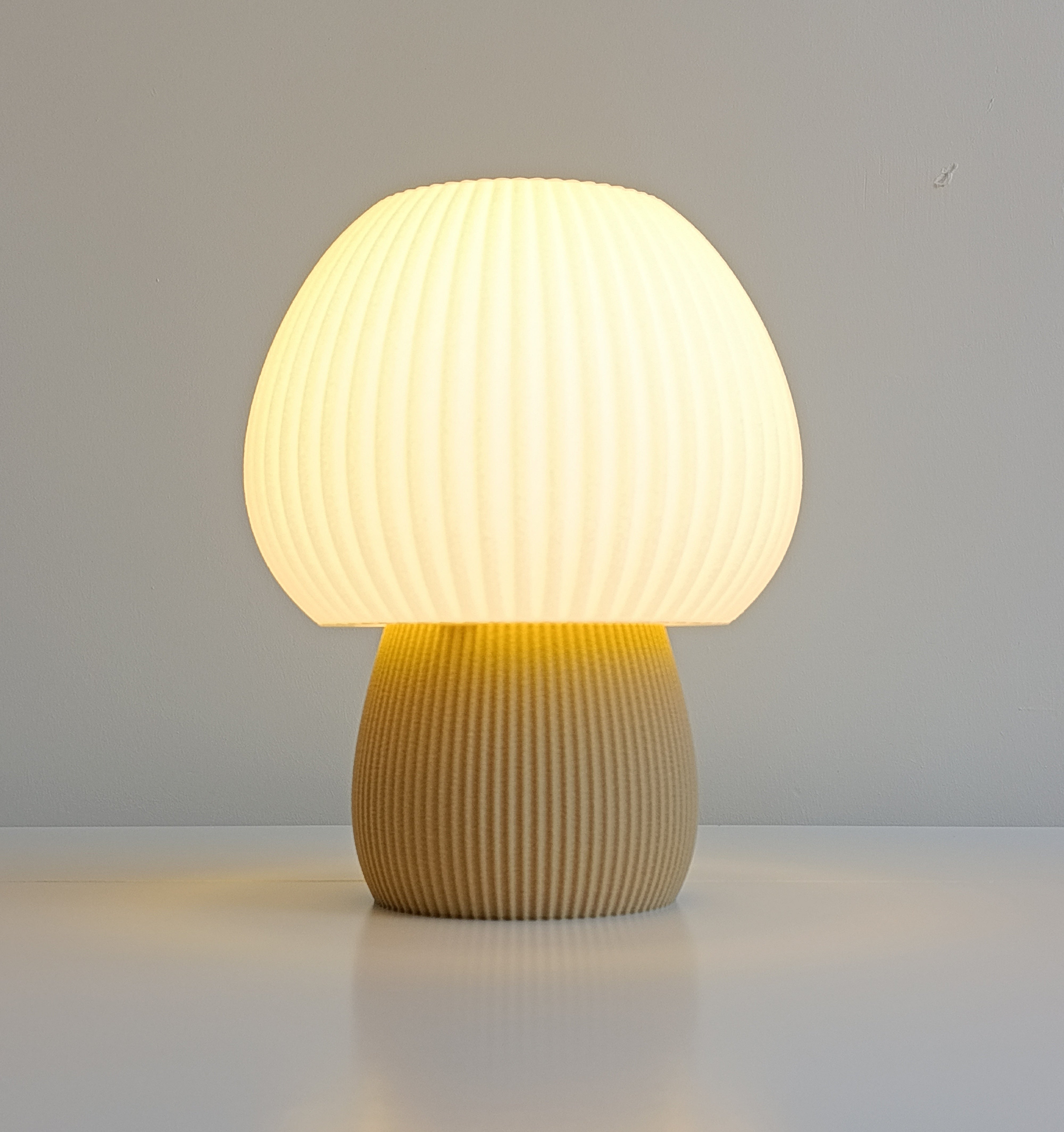
Different light sources emit different wavelengths. A tungsten bulb, for instance, emits more red and infrared wavelengths, while daylight contains a more balanced spectrum across the visible range. When you move an object from daylight into artificial light, you're not changing the object—you're changing the spectrum of light bouncing off it. Your brain then reinterprets those reflected wavelengths, and suddenly that deep blue wall looks purple, or that warm beige reads as greenish-gray.
This is why professional color matching in interior design requires viewing paint and fabric samples under the specific lighting conditions where they'll be used. A color that appears vibrant and true under full-spectrum daylight may look entirely different under standard incandescent or fluorescent fixtures.
Color Temperature and the Kelvin Scale
When lighting designers talk about how light affects color, they often reference color temperature, measured in Kelvin (K). The Kelvin scale measures how "warm" or "cool" a light source appears, ranging from around 1,000K (candlelight—deeply warm and orange) to 10,000K (clear blue sky—intensely cool and blue).
Here's what matters for your home:
- 2,700K (Warm White): Resembles incandescent bulbs; enhances warm colors like reds, oranges, and golds while making cool blues and greens appear muted
- 3,000-4,000K (Neutral/Cool White): A middle ground that provides balanced color rendering; colors appear closer to how they look in daylight
- 5,000K+ (Daylight/Cool): Mimics natural daylight; brings out cool tones and can make warm colors appear less saturated
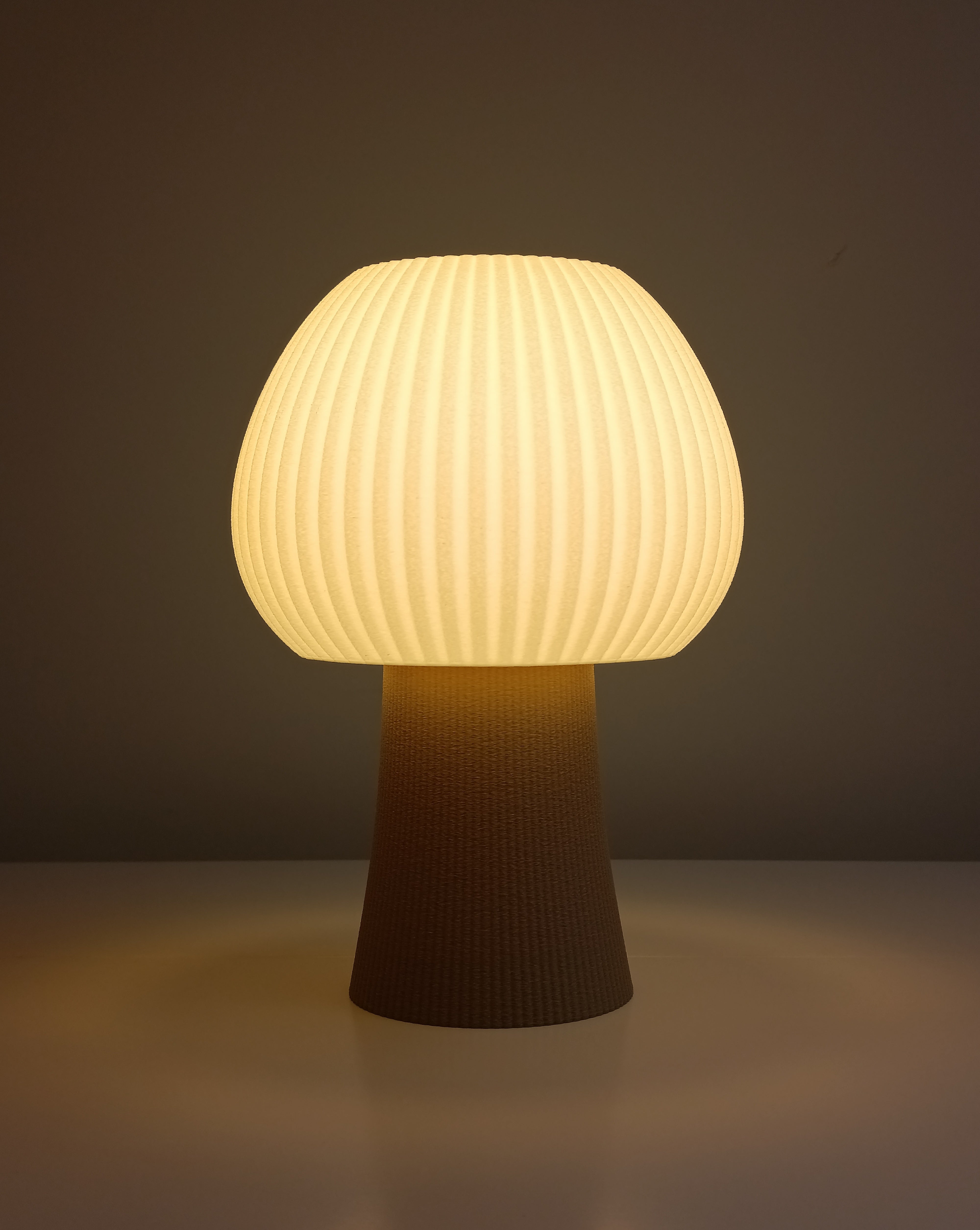
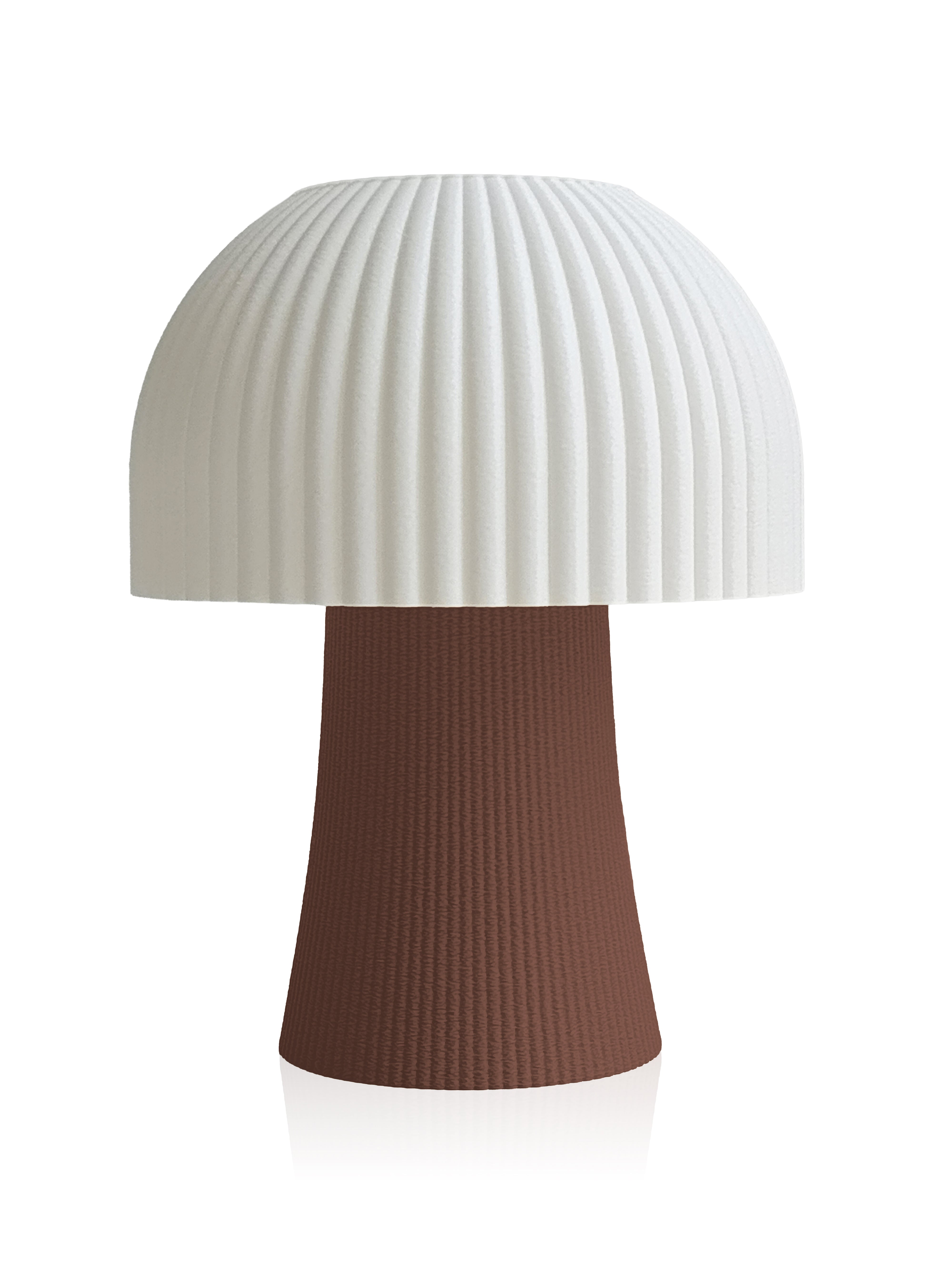
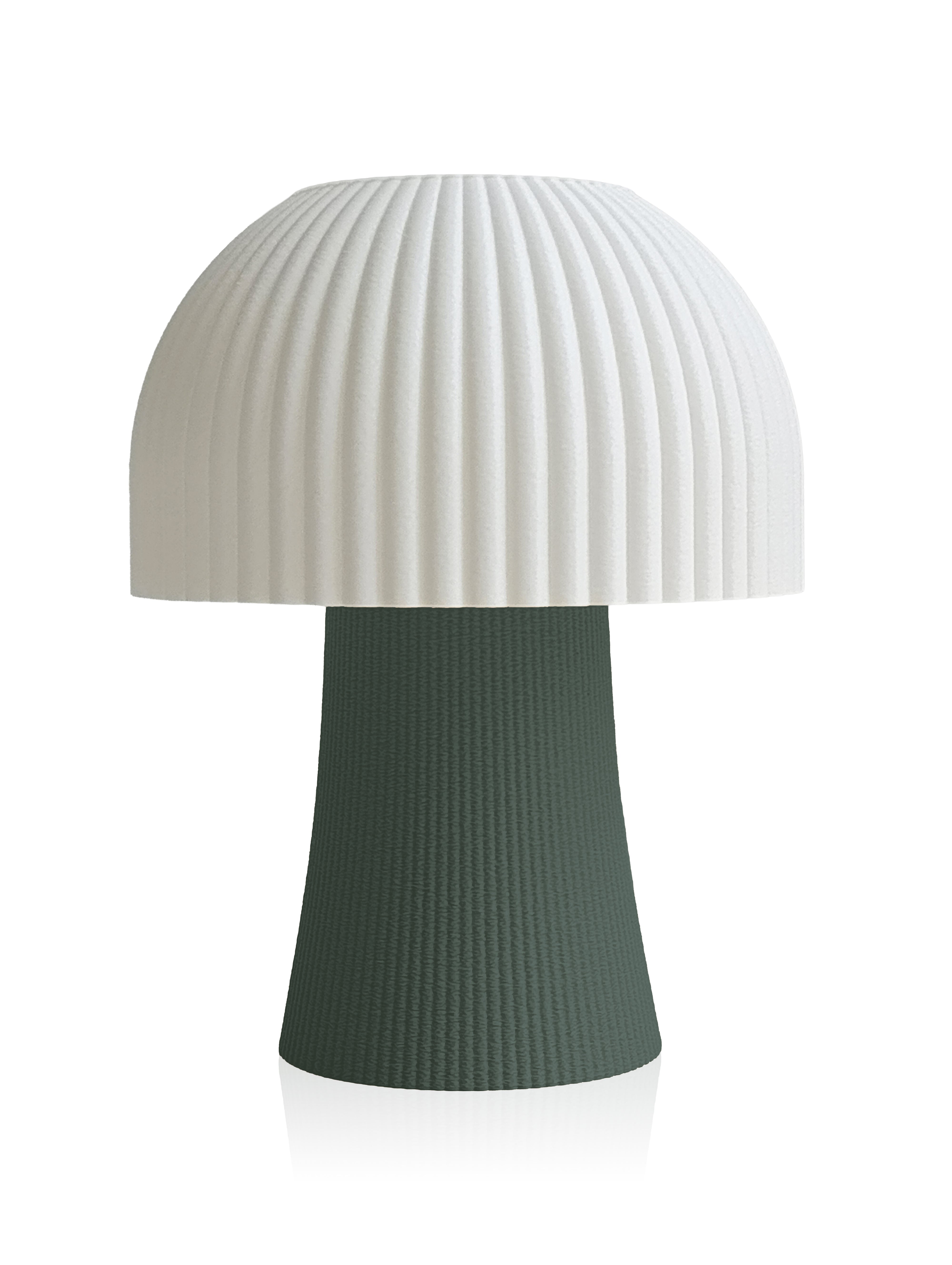
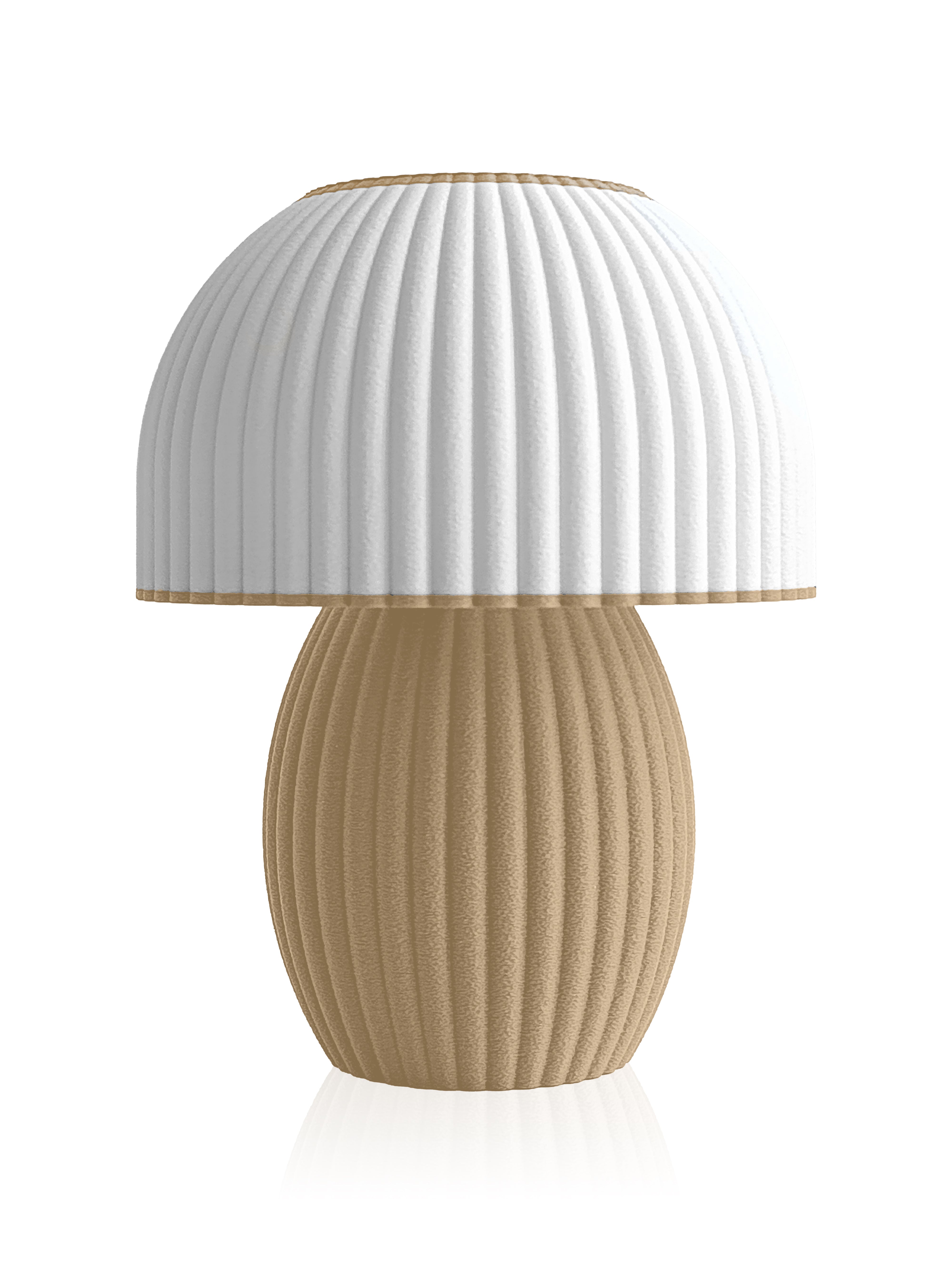
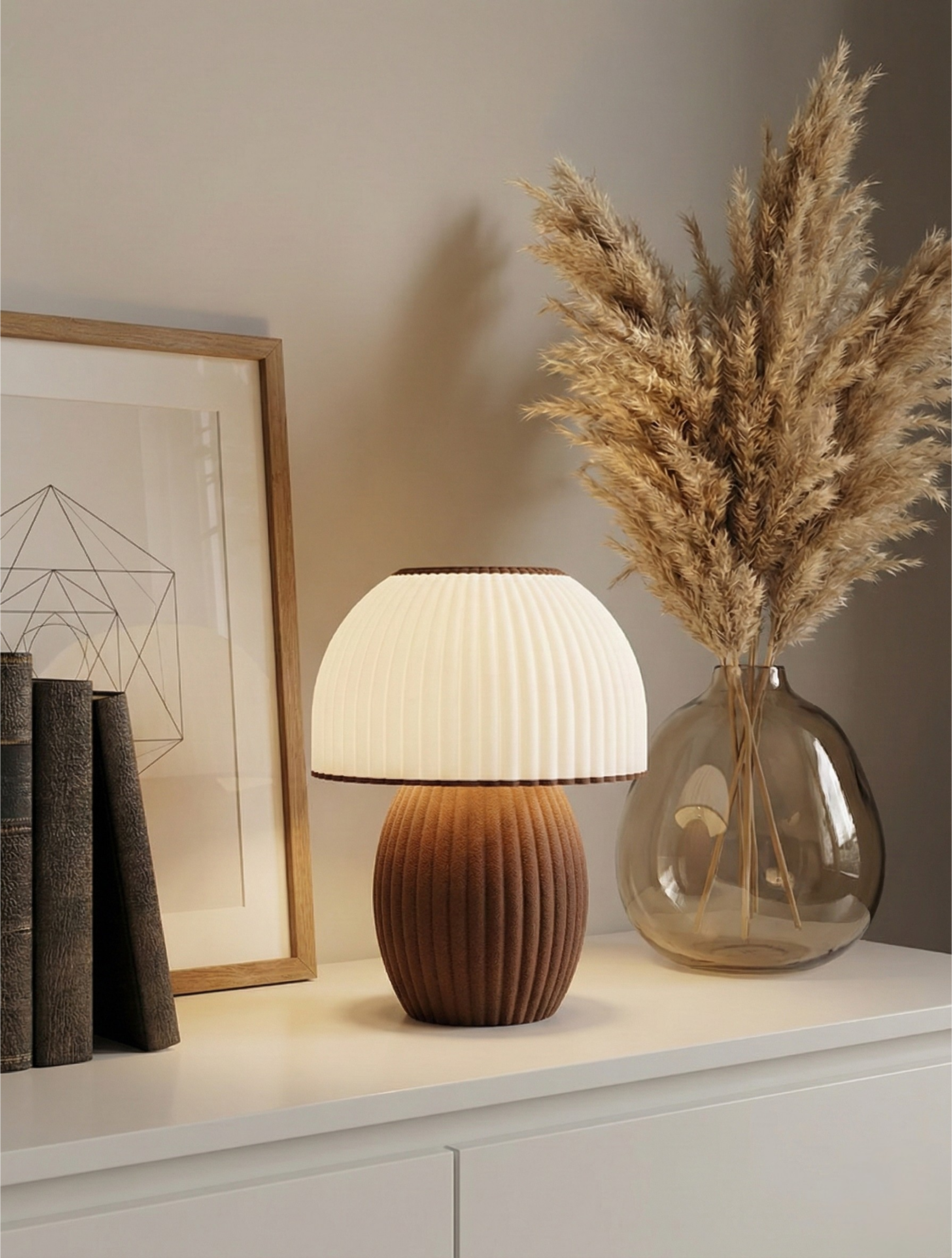
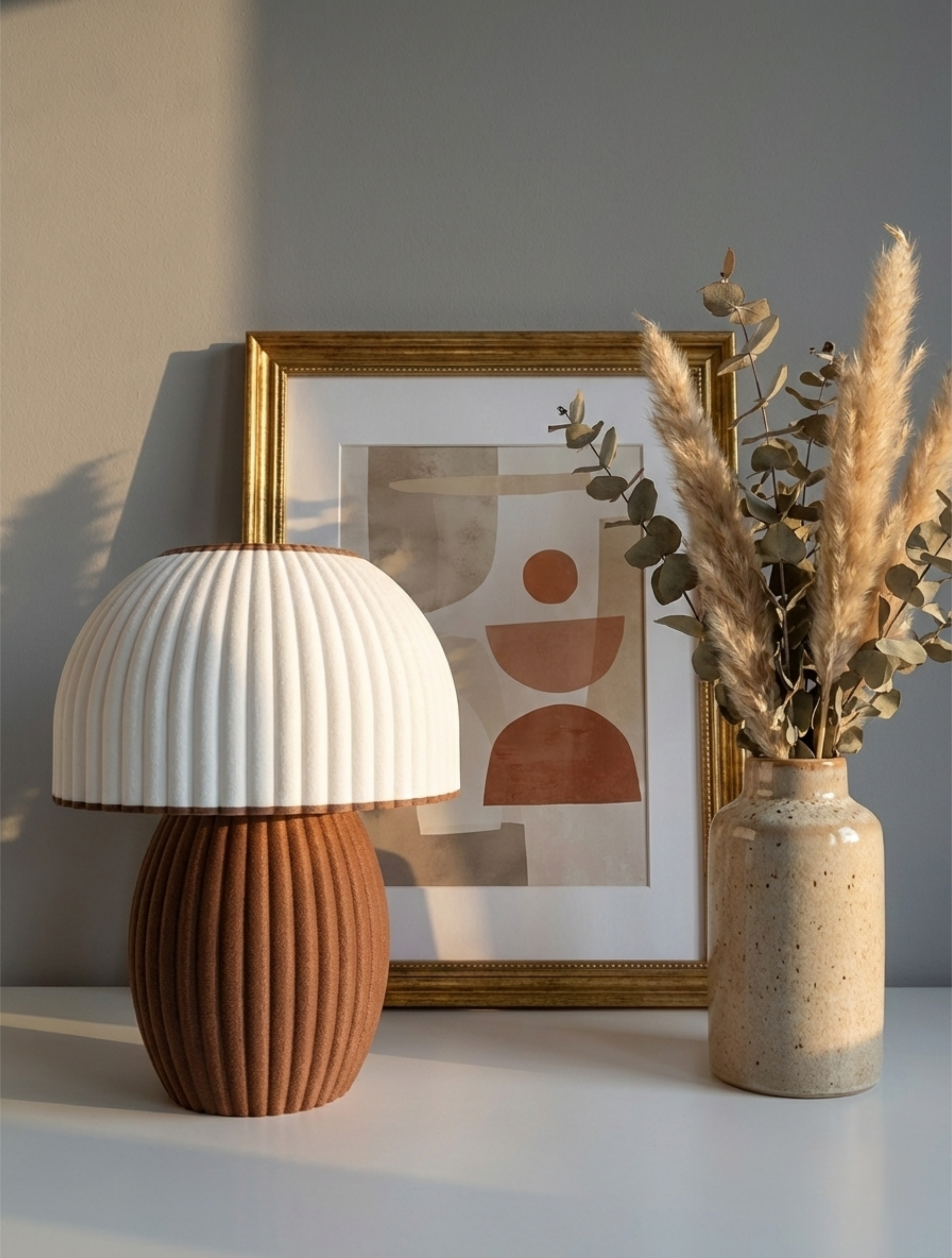
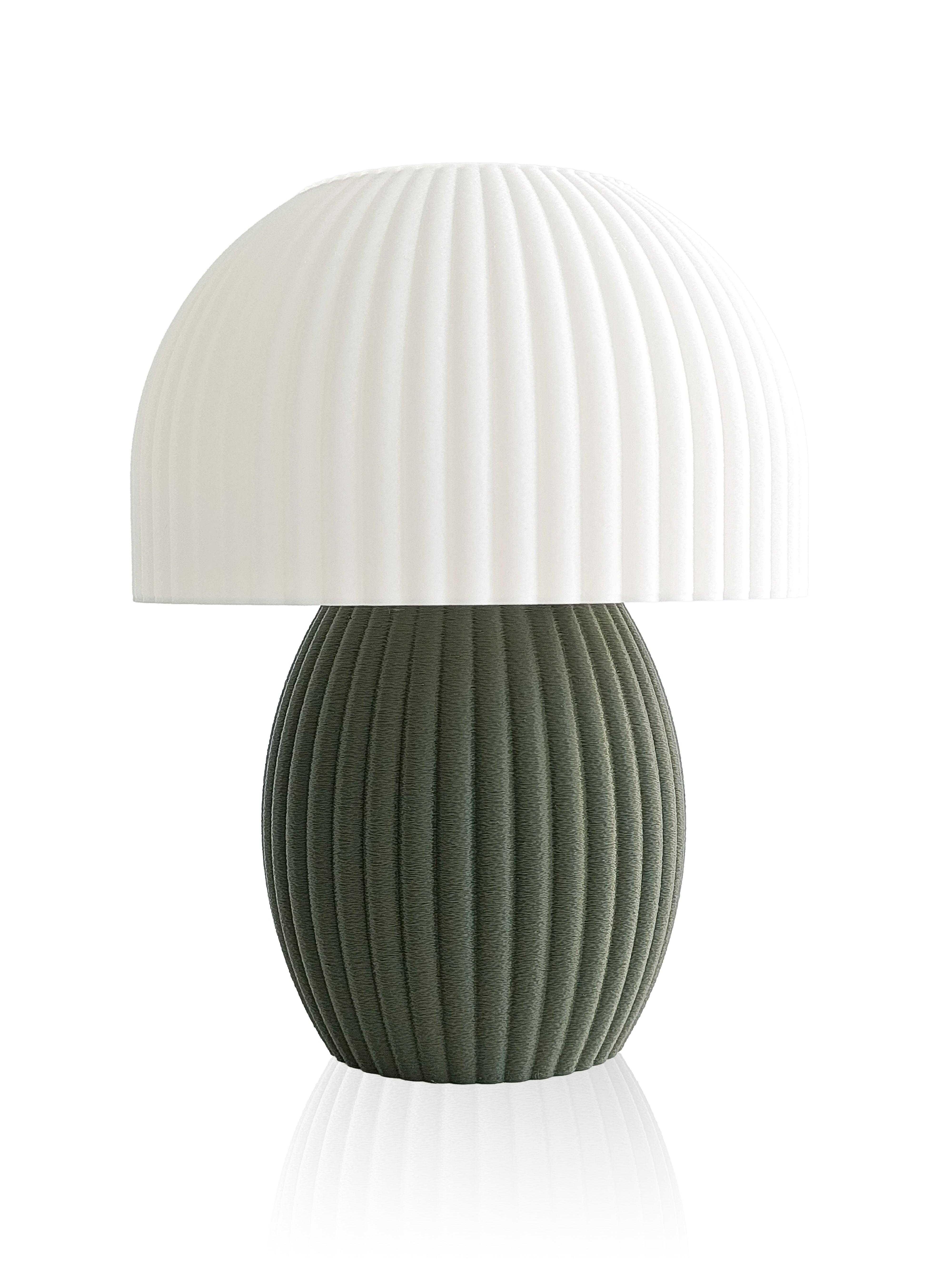
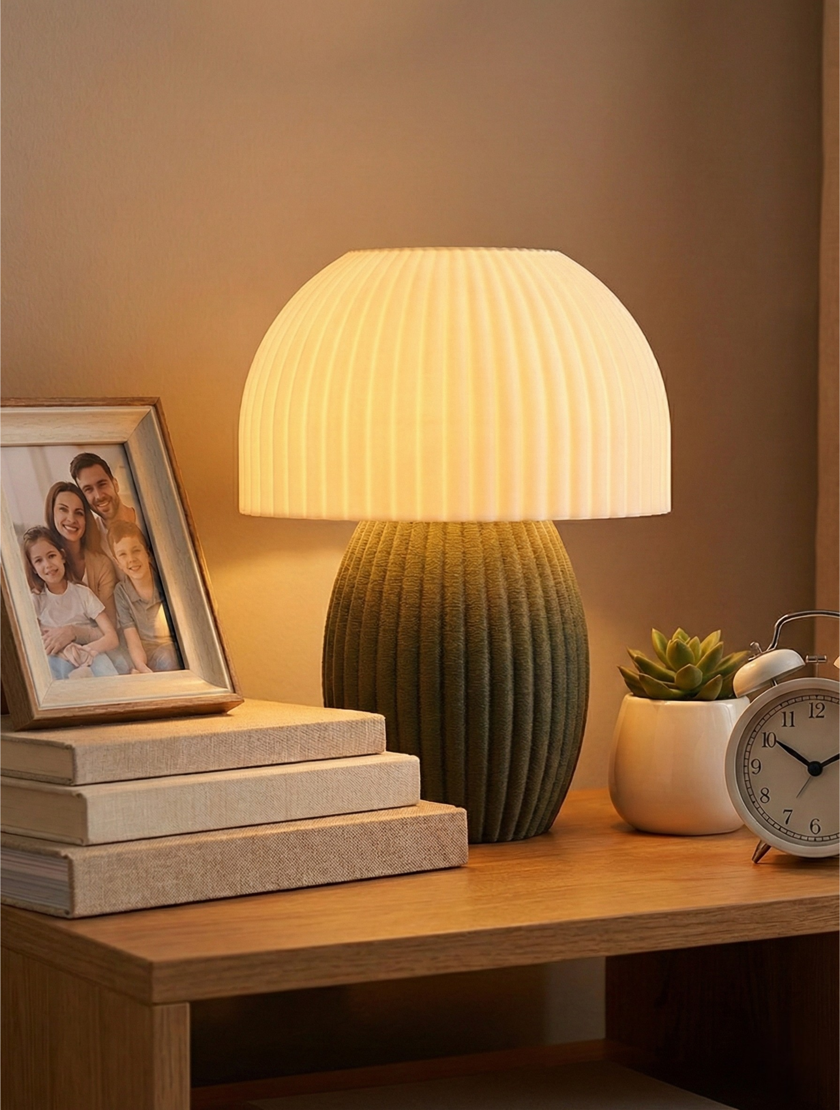
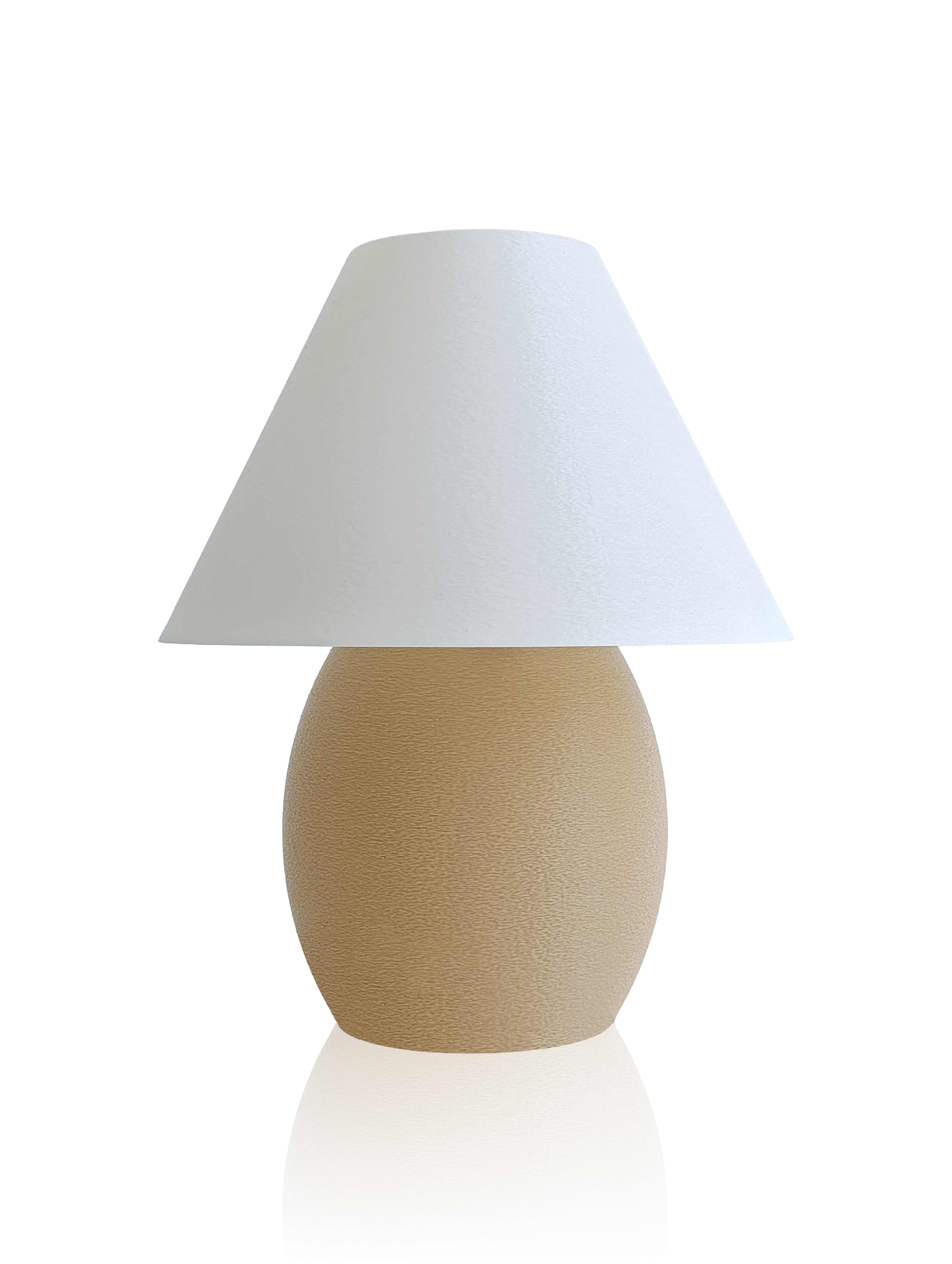
If you've ever felt that a room looked "off" despite having the right colors, the culprit is often color temperature mismatch. Warm lighting can make a space feel cozy and intimate, but it can also make certain accent colors disappear or shift unexpectedly. This is particularly important when selecting lighting for spaces where color accuracy matters—like home offices, closets, or art display areas. The Lumora US collection offers adjustable color temperature options, allowing you to dial in the exact warmth or coolness that brings your space to life.
How Different Rooms Demand Different Lighting Approaches
Your living room, bedroom, and kitchen all benefit from different lighting strategies because color perception needs vary by space and function. In bedrooms, warmer lighting (around 2,700K) supports relaxation and can enhance the perception of soft, soothing colors. In kitchens, where you're preparing food and need to see true colors (to judge ripeness, freshness, and food safety), neutral to slightly cool light (3,500-4,100K) is more practical.
Living rooms often call for layered lighting that shifts throughout the day and evening—brighter, cooler light during daytime hours for activities and social gathering, transitioning to warmer, dimmer light as evening approaches. This mimics our natural circadian rhythms and helps our eyes and mind adjust to the time of day.
The interplay between your wall colors, furnishings, and lighting creates a complete sensory experience. A room painted in soft gray will feel completely different under 2,700K warm light versus 5,000K daylight—one will feel intimate and cocoon-like; the other will feel spacious and energetic. There's no universally "right" choice; it depends on the mood you want to create in your home.
The Science of Color Rendering Index (CRI)
Beyond color temperature, there's another critical measure: Color Rendering Index, or CRI. CRI rates how accurately a light source reveals the true colors of objects compared to natural daylight or incandescent light, on a scale of 0-100. A CRI of 90 or higher is considered excellent for home use and means colors will appear vibrant and true.
Lower CRI lighting (70-80) can make colors appear flat, muted, or even distorted. This is why some artificial lighting feels harsh or unsettling—it's not just the brightness; it's that colors aren't rendering accurately, and our brains pick up on something being "off" even if we can't articulate why.
When selecting fixtures for your home, paying attention to both color temperature and CRI ensures that the colors you've carefully chosen for your space will actually look the way you intended. Quality lighting isn't just functional; it's a design partner that allows your home's true colors to shine.
Frequently Asked Questions
Does LED lighting affect color perception differently than incandescent?
Yes. Traditional incandescent bulbs emit a continuous spectrum naturally rich in warm wavelengths, while many early LED bulbs produced gaps in their spectrum, causing certain colors to appear muted or unnatural. However, modern high-CRI LEDs closely mimic natural light distribution, making them indistinguishable from incandescent in color rendering while using far less energy.
Can I change how colors look in my home just by changing the lighting?
Absolutely. Switching from 2,700K to 4,000K lighting will noticeably shift how every color in your room appears. Warm light enhances warm tones and subdues cool ones, while cooler light does the opposite. This is why it's worth experimenting with different color temperatures before committing to permanent paint or décor choices.
What color temperature is best for seeing true colors?
Neutral white light around 4,000K most closely matches how colors appear in standard daylight, making it ideal for spaces where color accuracy is important. However, "best" always depends on your goals—sometimes you want to enhance warmth and coziness over perfect color accuracy, and that's a valid design choice.
Your home deserves lighting that doesn't just illuminate; it reveals. When you understand how light shapes color perception, you gain the power to design spaces that not only look beautiful but feel exactly the way you want them to.


Share:
Light and Social Status: How Lighting Affects Prestige Perception
Light Polarity: Warm-Cool Light Balance in Home Design